Category Archives: Health

North Korea vs. South Korea

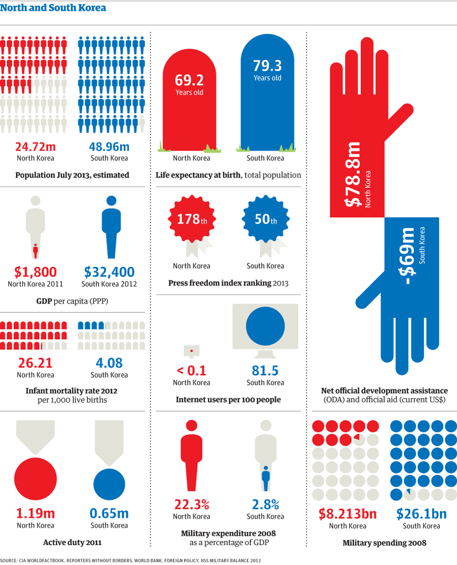
In this visualization created by The Guardian, we can see how North Korea compares to South Korea in terms of population, Gross Domestic Product (GDP), life expectancy, freedom of the press, military spending, internet connectivity, infant mortality, among other indicators.

North Korea is a poor country with half the population of South Korea. It is one of the worst countries in terms of corruption and freedom of the press. Its military spending constitutes approximately 22.3% of its GDP, compared to 2.8% for South Korea.

Additional resource: IndexMundi: South Korea vs. North Korea – Country Comparisons


Human Development Index 2012

The Human Development Index (HDI) is a composite measure that includes three indicators: life expectancy at birth, level of education attained, and income. The HDI is an alternative to the purely economical GDP, that quantifies economic growth only. Thus, the HDI provide a way to gauge the development of a country. The HDI for 2012 includes 187 countries.

The HDI ranks countries according to their degree of development using a scale from 0 to1, 0 being the least developed and 1 being the most developed country.

In the HDI map above, published by the Brazilian media site Globo.com we find that Norway has a score of 0.955, ranking number one as the most developed country (color green). Norway is followed by Australia, the U.S., the Netherlands, Germany, New Zealand, among others.

At the other end of the spectrum we find the least developed nations (color purple), including the majority of African nations, Pakistan, Afghanistan, Myanmar, Bangladesh, Nepal, and Papua New Guinea.


Major Causes of Death in the 20th Century

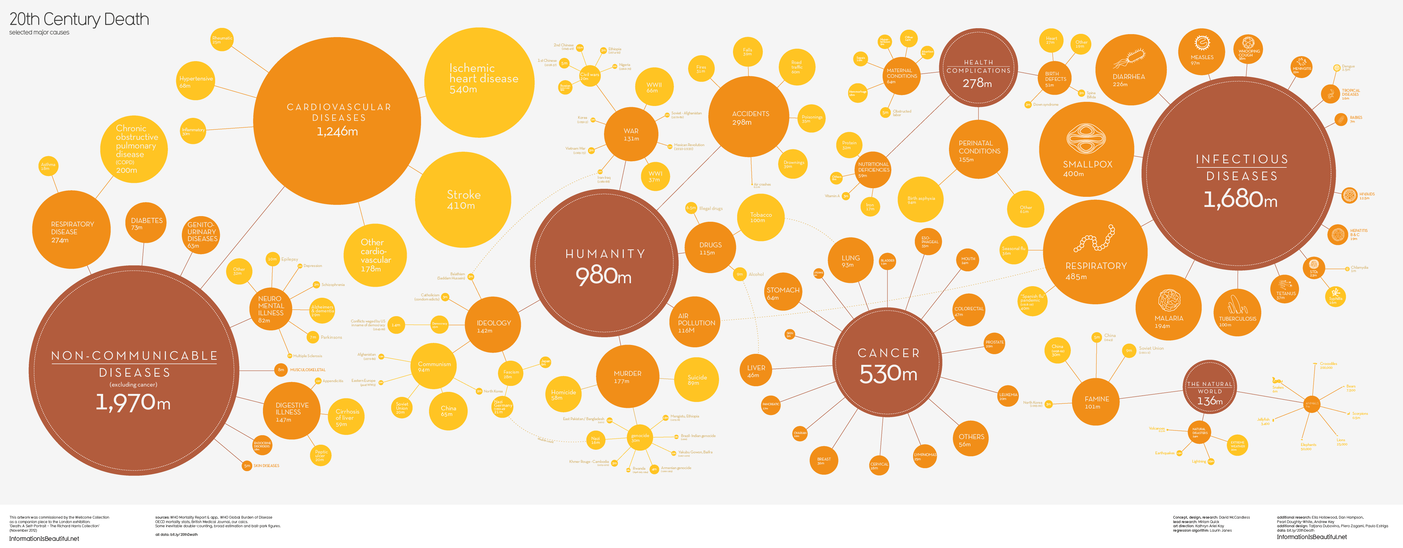
This visualization by Information is Beautiful shows the major causes of death for the 20th century.

According to the data in this graphic, the most common causes of death were non-communicable diseases (excluding cancer) such as cardiovascular diseases, diabetes, respiratory diseases, neuro-mental illness, and digestive illness; infectious diseases such as smallpox, diarrhea, malaria, tuberculosis, and respiratory diseases; death caused by humans such as murder, war, suicides, air pollution, drugs, and accidents; health complications, and cancer.


Health Insurance Rates by County for the U.S.

This map from The Daily Biz, created using data from the U.S. Census Bureau, shows health insurance rates by county for people under the age of 65 across the United States.

Darker areas represent the counties with higher rates of uninsured Americans, while lighter areas represent the counties with lower rates of uninsured people under age 65.

The higher rates of uninsured Americans can be found concentrated in the Western and Southwestern estates, and in some parts of the Southeast. By contrast, the rate of uninsured Americans is lower in the Northeast and parts of the Southeast and Midwest.


Cancer Death Rates for Men and Women

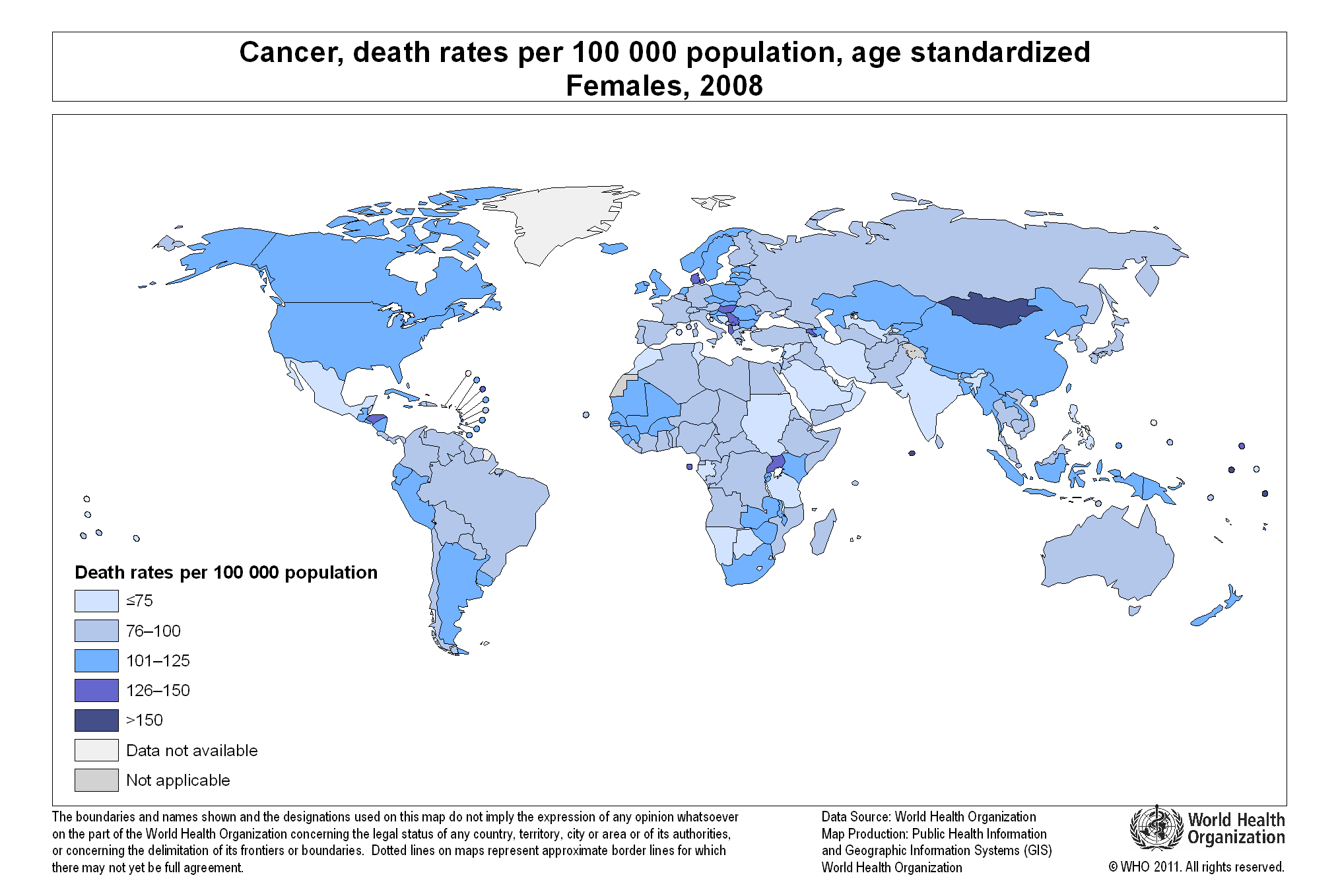
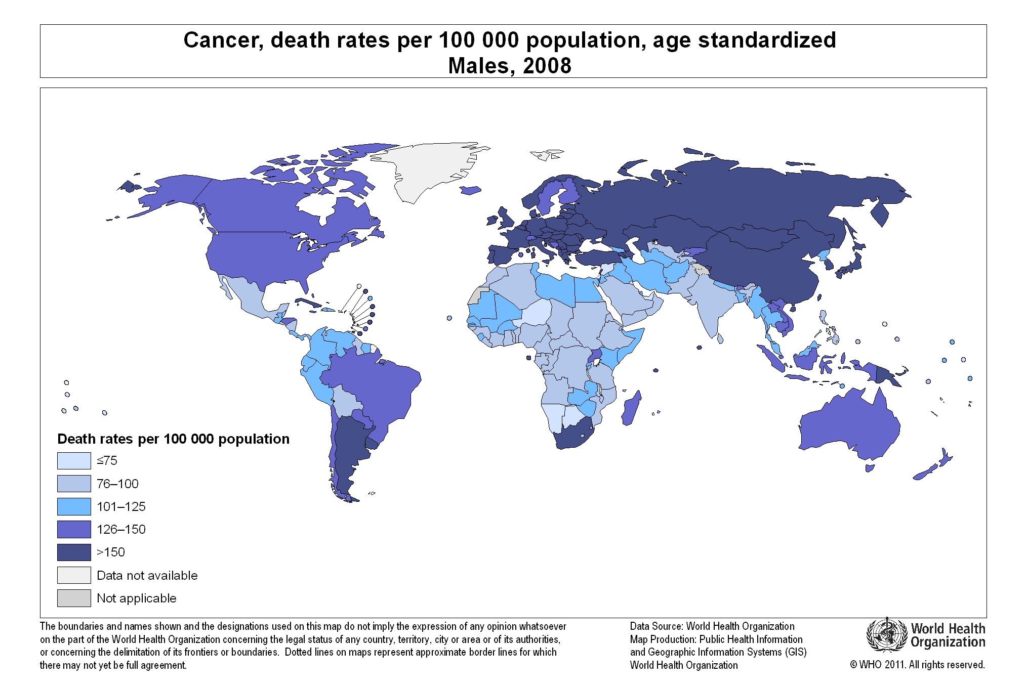
Cancer affects both women and men globally. However, cancer death rates are different for each gender, as can be seen in the two maps displayed in this article.

We find the highest cancer death rates for women (126 or more per 100,000 population) in Mongolia, Denmark, Albania, Macedonia, Uganda, and Honduras.

The cancer death rate for men is the highest (150 per 100,000 people) in most parts of the world, compared to women. Countries with high death rates for males include most European countries, Middle Eastern nations, Russia, Mongolia, Kazakhstan, China, Japan, South and North Korea, Turkey, South Africa, Argentina, Uruguay, and Cuba. Other countries with high death rates for males (126 or above per 100,000 people) include the United States, Canada, Brazil, and Australia.

We can only speculate about the factor behind this disparity in numbers of cancer death rates for men and women worldwide.

For detailed information, please visit:


Number of Doctors per 1,000 People per Country

The map above, created by the World Health Organization (WHO), shows the number of physicians per 1,000 people (for the latest available year) across the globe.

Countries with the largest number of physicians per 1,000 population include: San Marino (47.35), Cuba (6.72), Greece (6.17), Monaco (5.81) and Belarus (5.18).

Countries with the smallest number of doctors per 1,000 people include: Colombia, Nicaragua, Haiti, Liberia, Niger, sierra Leone, Rwanda, Ethiopia, Yemen, Afghanistan, Myanmar, Thailand, Cambodia, Indonesia, Papua New Guinea, etc.

Global Vitamin D Deficit

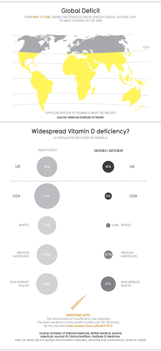
According to a 2010 infographic by Information is Beautiful, people inhabiting in the Northern hemisphere, more precisely above latitude 42°N, are not getting enough UVB light from sunlight to make vitamin D in the skin during winter season.

In the UK, 50% of the population has insufficient levels of vitamin D, while 16% of the population is severely deficient. In the United States, 77% of the population has insufficient levels of vitamin D, while 6% of the population is severely deficient. Within the U.S., the groups more affected by insufficient levels of vitamin D are Non-Hispanic blacks (98%) and Mexican Americans (90%).

To try compensate for the lack of UVB light in winter time and the consequent low vitamin D levels, consumers have turned to the vitamin D industry, an industry that is worth $460 million, as of 2009, in the U.S. alone.

For more graphics and statistics, visit: Information is Beautiful: Vitamin D

Mortality Numbers for Children Under Five

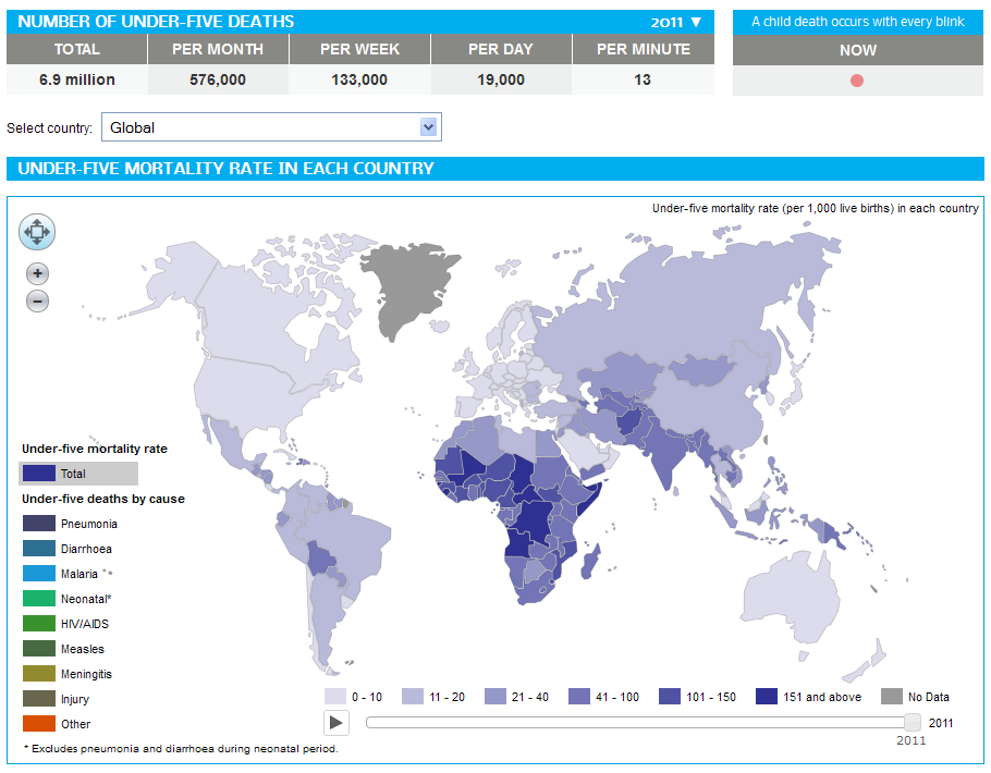
In 2011, 6.9 million children under five years old died around the globe from different causes ranging from pneumonia, malaria, diarrhea, HIV/AIDS, meningitis, to all kinds of injuries.

The number of deaths of children under five has decreased by 59% in the last forty years, from 16.9 million back in 1970 to 6.9 million in 2011. That is good news for the world in general; however, there are still regions in the planet where under-five mortality rates have changed hardly at all. That is the case of Africa, where countries with the highest under-five mortality rates include Sierra Leone, Somalia, Mali, Chad, Democratic Republic of the Congo, Central African Republic, Guinea-Bissau, and Angola. In other parts of the world, countries with high under-five mortality rates include Afghanistan, India, Pakistan, Papua New Guinea, Haiti and Bolivia.
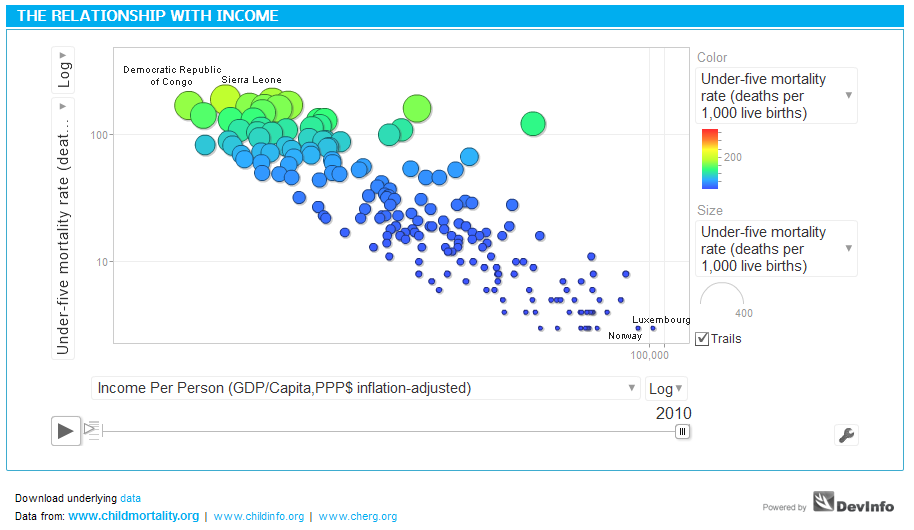
Income is a critical factor influencing under-five mortality rates, as shown in the graph above. The larger the income per capita of a nation, the lower the mortality rate. Such is the case of developed economies like Luxembourg or Norway, in stark contrast with developing countries like Somalia or Sierra Leone, where income per capita is very low.

Source: Health Intelligence: Under-five Mortality dashboard
 

It Is Flu Time!

Right now it is flu season in the northern hemisphere. The flu (influenza) is a contagious respiratory disease caused by influenza viruses.

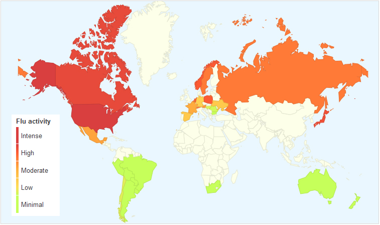
Google Trends created the map shown above, based on aggregate data generated by users searching for the word “flu” and related terms, in order to estimate flu activity worldwide. According to data captured by Google Trends, flu activity is very intense in the U.S. at the moment. Canada, Russia, Norway, Poland, the Netherlands and Japan show high flu activity as well.


The Centers for Disease Control and Prevention (CDC) tracks the geographical spread of flu across the United States, however, the collected data does not reflect intensity of influenza activity.

As can be seen in the map, the flu has spread relatively quickly in the last three weeks throughout the continental United States. California, Mississippi and the District of Columbia show local influenza activity at the moment.


We Live Longer

click to enlarge

Average global life expectancy is now 70.4 years; 73.3 for women and 67.5 for men.

Life expectancy has gone up significantly in places like Iran, Bangladesh, the Maldives, South America and Africa, where the increase has been of 13 years or more, compared to previous decades. North America, Western Europe and Australasia have seen a modest increase of 7 plus years.

The rise in life expectancy has been possible thanks to the improvement in health programs and the control/cure of many infectious diseases that ended up in death, especially in young children.

But, there are places where the rise has been negligible like Eastern Europe, with an average increase of just 1 year. Other places have even experienced a decline in life expectancy. Such is the case of Lesotho and Belarus, which have seen a rise in HIV and alcoholism, respectively.

According to a report published by The Lancet, although we live longer now, the quality of life has declined due to the rise in obesity and its consequences: diabetes, high blood pressure and heart conditions.

Resources: