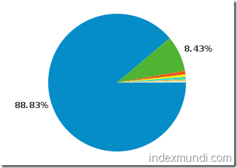
One of the side benefits of running a highly trafficked global site is that we can analyze and confirm changes in the market share of PC operating systems. Here is a graph showing OS market share for the past 30 days:
The large blue slice of the pie chart corresponds to all Microsoft operating systems, while the small green slice corresponds to all Macintosh operating systems.
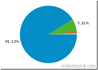
Contrast the graph above with a similar one for the same period in 2009:
If our visitors are representative of the overall universe of web users, it looks like Microsoft has lost significant market share to Apple.

