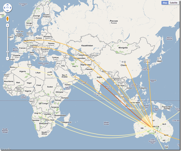
We are currently processing the results of our commodities trade survey. We figured that a good way to display the results would be through a map visualization showing trade flows to and from each country represented in the survey. The image below shows one of the visualizations (click on it for a larger version).
The map shows trade flows from Australia. Lighter lines represent trade flows with a small number of deals. Darker lines are used for trade flows with larger number of deals. Stay tuned for more results.
Update (August 15th, 2011): You can now play with our trade flow visualizations.
