Author Archives: Claudia Soria

It Is Flu Time!

Right now it is flu season in the northern hemisphere. The flu (influenza) is a contagious respiratory disease caused by influenza viruses.

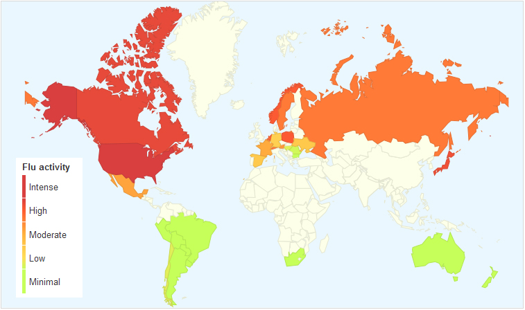
Google Trends created the map shown above, based on aggregate data generated by users searching for the word “flu” and related terms, in order to estimate flu activity worldwide. According to data captured by Google Trends, flu activity is very intense in the U.S. at the moment. Canada, Russia, Norway, Poland, the Netherlands and Japan show high flu activity as well.


The Centers for Disease Control and Prevention (CDC) tracks the geographical spread of flu across the United States, however, the collected data does not reflect intensity of influenza activity.

As can be seen in the map, the flu has spread relatively quickly in the last three weeks throughout the continental United States. California, Mississippi and the District of Columbia show local influenza activity at the moment.


We Live Longer

click to enlarge

Average global life expectancy is now 70.4 years; 73.3 for women and 67.5 for men.

Life expectancy has gone up significantly in places like Iran, Bangladesh, the Maldives, South America and Africa, where the increase has been of 13 years or more, compared to previous decades. North America, Western Europe and Australasia have seen a modest increase of 7 plus years.

The rise in life expectancy has been possible thanks to the improvement in health programs and the control/cure of many infectious diseases that ended up in death, especially in young children.

But, there are places where the rise has been negligible like Eastern Europe, with an average increase of just 1 year. Other places have even experienced a decline in life expectancy. Such is the case of Lesotho and Belarus, which have seen a rise in HIV and alcoholism, respectively.

According to a report published by The Lancet, although we live longer now, the quality of life has declined due to the rise in obesity and its consequences: diabetes, high blood pressure and heart conditions.

Resources:


Unsafest Countries for Women

click to enlarge

This map created as part of the WomenStats Project, is aimed at determining the relationship of security and behavior of states and the security of women living in those states. It has built a global database of the status of women worldwide, with data from 174 countries.

As seen in the map for the year 2009, countries where women experience lack of physical security include India, Pakistan, Afghanistan, Indonesia and other Muslim countries in Asia and Africa. In the Americas, Peru seems to be the place were women lack physical security the most. The darkest color in the map indicates the highest degree of lack of physical security for women.

For more information visit: WomanStats Database


World Leaders on Twitter

click to enlarge

Heads of state have realized the importance of being active in social media. The number of heads of state with Twitter accounts increased 78% in 2012 with respect to 2011, according to a report by the Digital Policy Council. Roughly 75% of them have Twitter accounts. According to a Washington Post article, world leaders that tweet more come from countries that have a tradition of transparency. 63% of the them come from “politically stable” countries.

President Barack Obama (@BarackObama) has the largest number of followers on Twitter for a head of state, with more than 25 million followers. In second place comes Venezuelan president Hugo Chavez (@chavezcandanga) with 3.8 million followers. Turkish president Abdullah Gül (@cbabdullahgul) comes in third place with 2.6 million followers, and Queen Rania of Jordan (@QueenRania) is fourth with 2.5 million followers. Russian prime minister Dmitry Medvedev (@MedvedevRussiaE) comes in fifth place, and Brazilian president Dilma Rouseff (@dilmabr) comes in sixth place.

Other countries with leaders who have Twitter accounts include, Germany, India, Morocco, Tunisia, India, Argentina, Somalia among others. Even Pope Benedict XVI (@Pontifex) has Twitter presence.

For more information visit: Digital Daya: World Leaders on Twitter – Ranking Report, December 2012.


Gun Ownership Worldwide

click to enlarge

Using data from the United Nations Office on Drugs and Crime (UNODC) on homicides by firearms worldwide, we can see that the United States has the highest average of gun ownership, 88.8 per 100 people. The U.S. is followed by Yemen with 54.8 average per 100 people, Switzerland with 45.7, and Finland with 45.3 average per 100 people. Although, these countries rate at the top in gun ownership, their numbers are much lower compared to the U.S.

According to this data, countries with the lowest gun ownership include: Tunisia, East Timor, Ethiopia, Ghana, Bangladesh, Eritrea, Fiji, among others.

For more information visit:


The Cheapest and Most Expensive Places to Fill Your Gas Tank

click to enlarge

Gas prices go up or down according to supply-demand forces and to movements in the commodities market. According to this map, published by the Car and Driver blog, prices in the United States ($3.85 per gallon) are not that bad compared to gas prices in other countries.

European nations have the highest gas prices, above $7 per gallon. If you were in Turkey you will have to pay the highest price, a steep $9.39 per gallon. Turkey’s gas prices are followed by Norway ($9.38), Italy ( $9.00), Sweden ($8.75), the United Kingdom ($8.46), Germany ($8.29), and Iceland ($8.01).

In the Americas, the highest gas prices can be found in Belize ($7.59), followed by Uruguay ($6.99), Chile($6.60), Peru ($5.95), Argentina ($5.52) and Canada ($5.14). Gas prices are significantly low in Venezuela ($0.06) and Bolivia ($2.05) due to government subsidies.

Africa enjoys low gas prices, except for Djibouti ($6.48), Madagascar ($5.74), Zimbabwe ($5.38), and South Africa ($5.15).

In Asia, Japan pays the highest gas prices, $6.87 per gallon, followed by the Philippines ($5.43), and India ($5.42).

In Australia, New Zealand and Australia’s gas prices per gallon are $6.75 and $5.64, respectively.


The United States of Walmart

click to enlarge

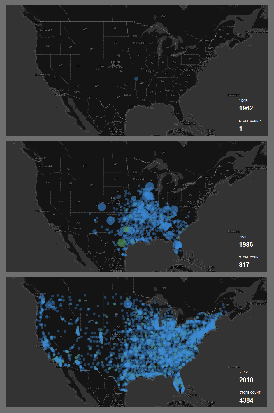
Walmart opened its first store in Rogers, Arkansas, back in 1962. From there it spread slowly through the South East. By 1986, twenty five years later, Walmart had 817 stores in the continental U.S. As of 2010, Walmart had 4,384 stores covering the entire country, including Hawaii, Alaska and Puerto Rico, but heavily concentrated in the East Coast and part of the Mid West.

Walmart is the world’s third largest public corporation, preceded only by Dutch Shell Company y Exxon Mobil.

For the interactive map, visit: Flowing Data: Watching the growth of Walmart


The Best and Worst Places to be Born in 2013

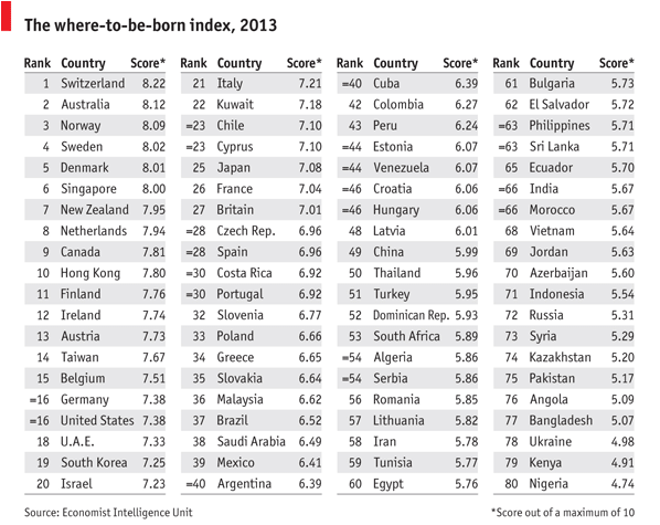
Back in 1988, the United States was ranked first as the best country to be born. Twenty five years later, the U.S. is ranked number 16.

The Economist Intelligence Unit compiled the where-to-be-born index which measures which country will provide the best opportunities to someone born in 2013. It links the results of life satisfaction surveys to indicators that affect the quality of life in those countries, such as geography, demographics, culture, government policies, the economy, etc.

Based on those factors, the best places to be born are Switzerland, Australia followed by Norway, Sweden Denmark, and Singapore. At the bottom of the list you will find Nigeria, Kenya, Ukraine, Bangladesh, Angola, Pakistan, among others.


Pope Benedict XVI is on Twitter

click to enlarge

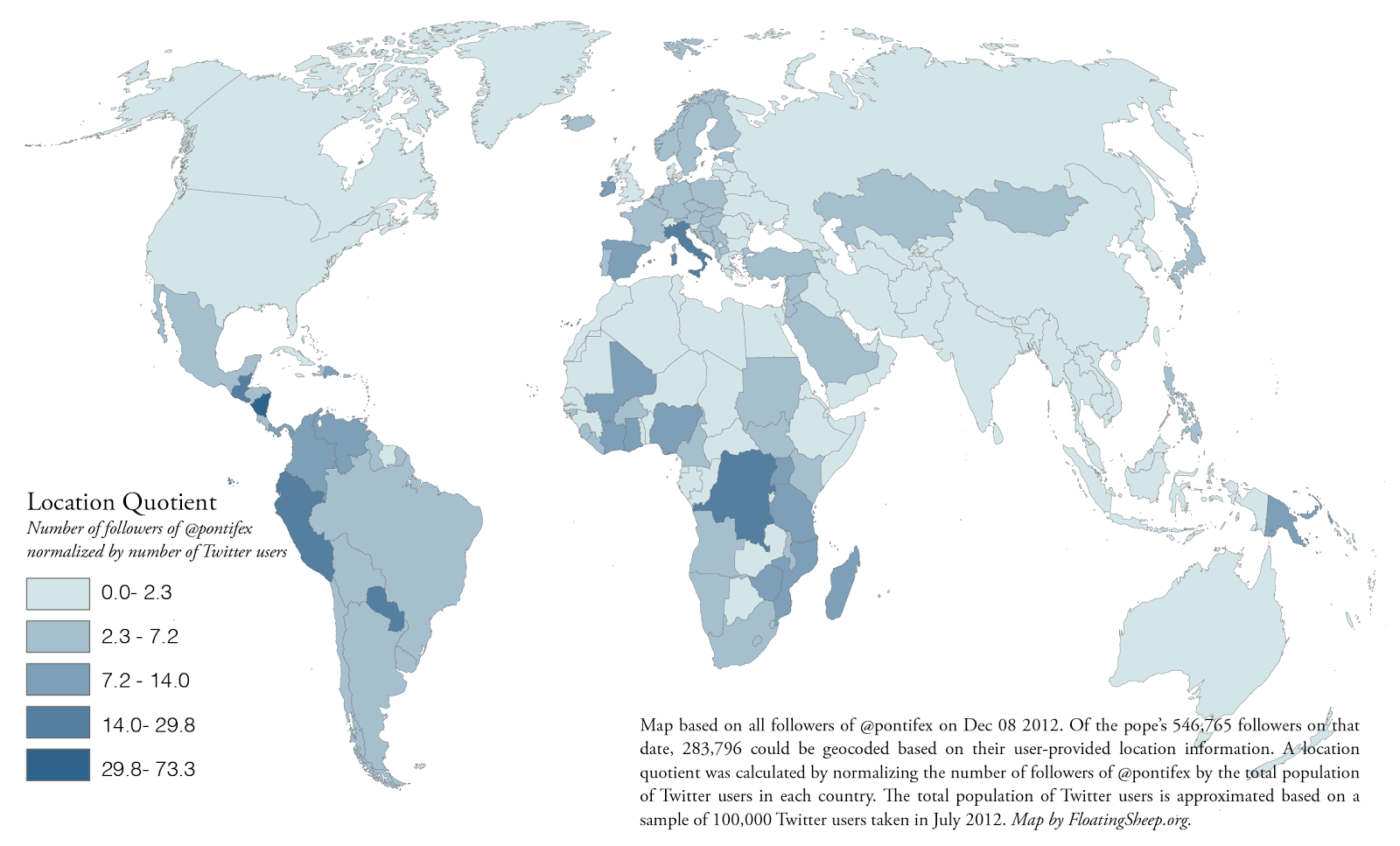
Pope Benedict XVI has Twitter presence beginning December, 2012. His English language account @Pontifex already has 1,342,380 followers from all around the world, and has sent 14 tweets. The Floating Sheep blog mapped followers of this account based on their location as of December 8, 2012. According to this map, the largest number of followers were located in Italy and Nicaragua, followed by the Democratic Republic of Congo, Guatemala, Peru, Ecuador, Paraguay, Spain and Ireland among others.


The Global Public Debt Clock is Ticking

click to enlarge

Global public debt is increasing every second. This debt clock shows government debt, in dollar terms, for almost all countries. Governments with the highest debt include the United States, Canada, Brazil, Australia, India, China, and several western European nations.

Additional indicators such as public debt per person, public debt as percentage of GDP, total annual debt change, and country debt comparisons can be seen in the interactive map at: The Economist: The global debt clock