Author Archives: Claudia Soria

The United States as Mapped by Starbucks Locations

click to enlarge

In a thought-provoking article, James Davenport from the blog IfWeAssume.com, mentions interesting facts about the location of Starbucks coffee shops in different cities in the U.S. For example, the closer you live to a Starbucks, the more likely your rent is going to be higher. Another interesting fact is that Starbucks locations are clustered around major cities and highways, as shown in the map. He concludes that more than 80% of the U.S. population, about 250 million people, live within 20 miles of a Starbucks.

 

California’s Skyrocketing Gas Prices

click to enlarge

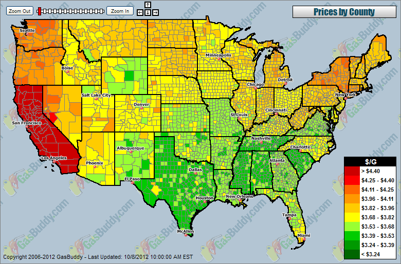
Gasoline prices in the U.S. have been rising lately, but for California the increase has been steeper. According to data of gas prices per county compiled by GasBuddy.com, prices in California are the highest in the U.S. California’s gas prices skyrocketed over the weekend due to supply disruption caused by a power outage to an Exxon Mobil plant in that state. As a result, regular gasoline reached an average record price of $4.614 per gallon.


Income Distribution by Religious Belief Groups

Click to enlarge

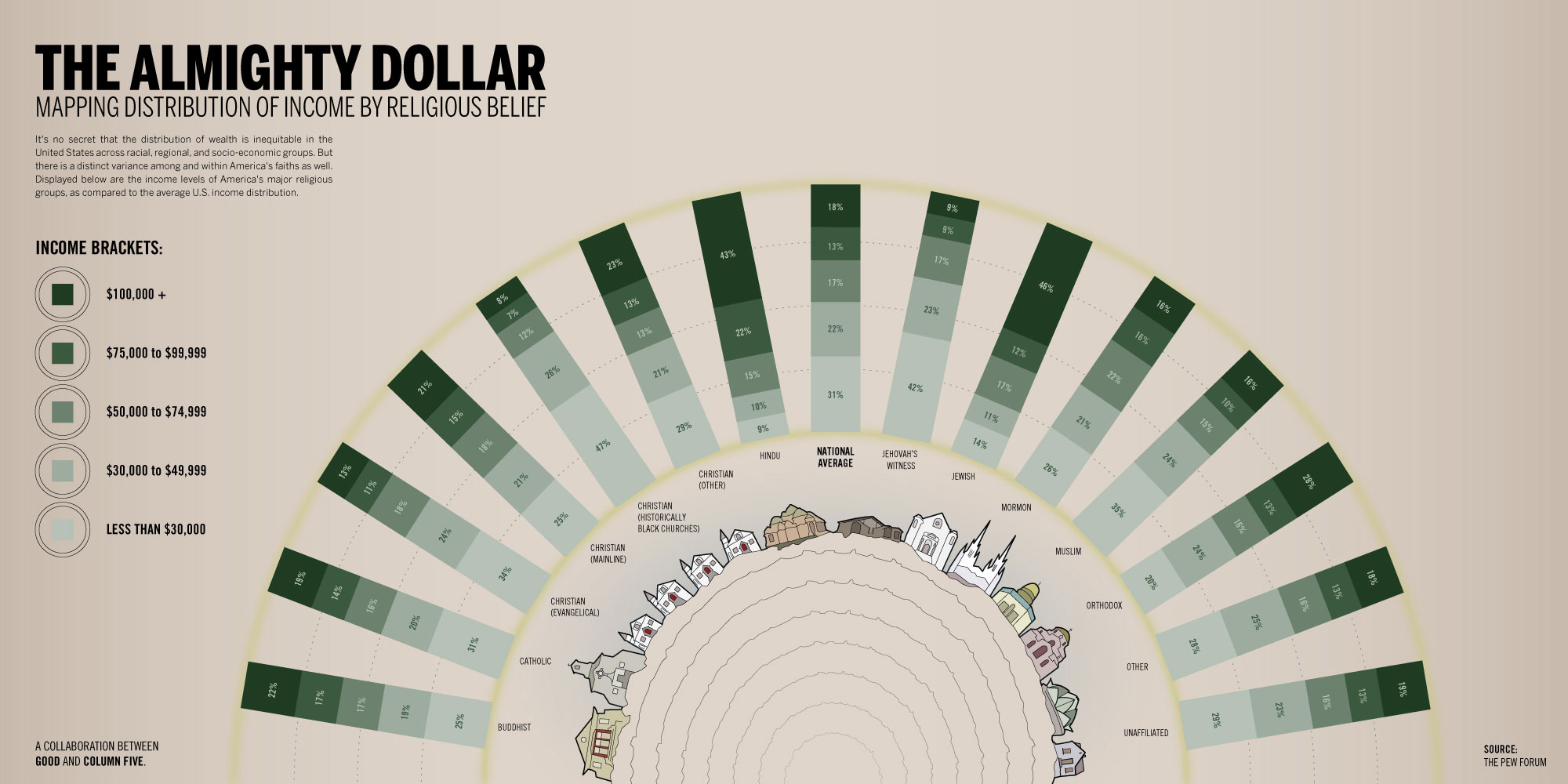
This infographic by GOOD shows the income distribution according to different religious belief groups. It is interesting to notice that 43% of people with Hindu beliefs earn an average income of 100K or more. For people with Jewish beliefs the percentage is 46%, compared to 21% for people with Christian beliefs (mainline), and 8% for people with Christian beliefs (Black churches). Click on the image for more detail.


Of Beer and Politics

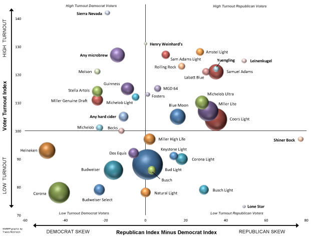
According to an article published by the National Journal, the brand of beer you drink is related to how you will vote in the upcoming elections. If you like Coors Light or Samuel Adams, you are likely to vote Republican. On the other hand, if you like Heineken or Guinness, you are likely to vote Democrat. Dos Equis and Bud Light are beer brands liked on both sides of the aisle.

Related links:


How Many of Gallons of Gas Can You Purchase With Your Weekly Income?

Click to enlarge

The average weekly income in the US has been going up in the last fifty years, at least in nominal terms, as seen in the first graph. The price of a gallon of gas has been trending up as well, with spikes beginning in 2002 up to 2008, when gas prices decreased dramatically as a consequence of the economic recession. In 2010 gas prices increased again and continue rising to this day, as seen in the second graph. It is worth noting that the number of gallons of gas that can be purchased by a person earning an average income has been decreasing steadily since 1998.


Housing Market: Home Prices are Up!

The latest numbers for the S&P/Case-Shiller House Price Index, just released, show an increase in home prices for twenty major cities in the United States. Both the 20-City Composite and 10-City Composite show similar trends, the first with a 1.6% increase and the second with a 1.5% increase for the month of July 2012. This numbers constitute a second year-over-year rise, following a decline in 2010 caused by the end of the Housing Stimulus package in April of that same year.


Life Expectancy vs. Fertility Rates Worldwide 1960-2010

click to enlarge

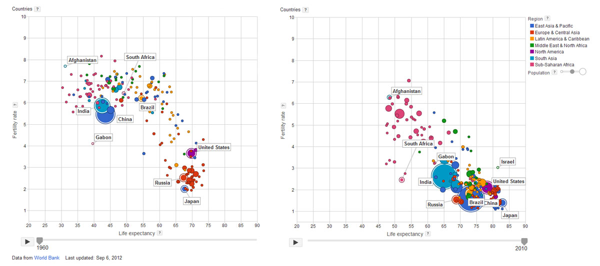
During the last fifty years, we have seen the gradual increase in life expectancy and the corresponding decrease in fertility rates worldwide. This is clearly the case of countries like China, India, the United States, Brazil, Japan, and Gabon, where dramatic improvements can be seen. On the other hand, countries like Russia, South Africa and Afghanistan, show moderate improvement.

It is very interesting to note, that although they have improved, a large cluster of African countries remain far from the overall trend, with lower life expectancy rates and higher fertility rates. For more information, check Google’s interactive bubble chart based on World Bank data.


How Does Your Country Compare to U.S. States?

These interactive maps from the Economist provide an interesting comparison between different countries and US states.

Using the criteria of GDP (Gross Domestic Product), the economy of California is approximately the size of Italy, Texas the size of Russia, Florida the size of the Netherlands, and Alabama the size of Nigeria.

Using the criteria of Population, California is approximately the size of Poland, Washington  the size of Lebanon, Arizona the size of Libya, and Minnesota the size of Finland, to name a few.


Bleak Estimates for Corn Yields and Grain Stocks for 2012

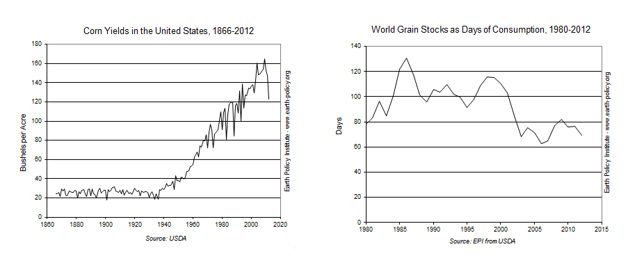
According to the Earth Policy Institute, drought conditions have generated bleak corn yield estimates for the remainder of 2012. Corn yields for September 2012 are estimated at 123 bushels per acre, which would make it the lowest yield since 1995. Compare this yield to the highest ever value of 165 bushels per acre, which was last reached in 2009.

As a consequence, the price of corn has increased significantly. It reached a record high of $8 per bushel in the corn futures market back in July, and has fluctuated around that price since then. Another consequence is the expected fall in global grain supplies. Supplies are expected to fall to 432 million tons, or 69 days of global consumption.

Poverty in the U.S.

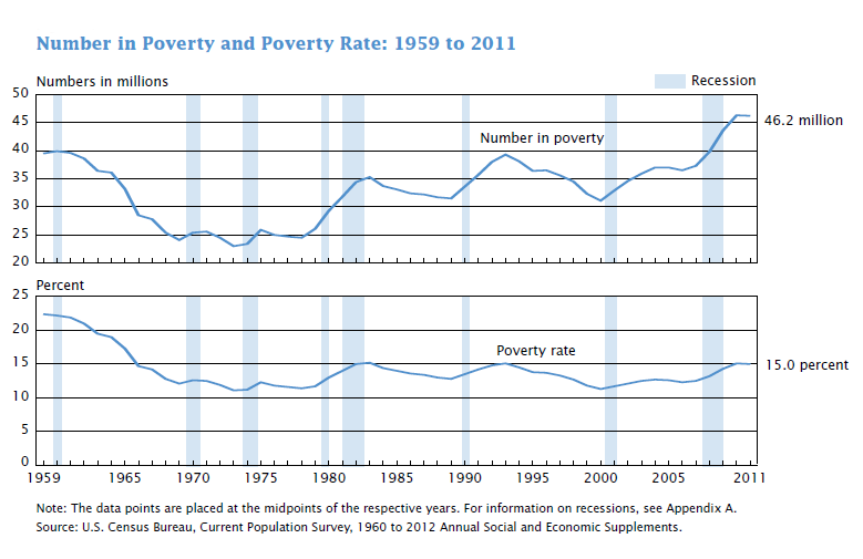
According to data just released by the U.S. Census Bureau, 15% of the population lives in poverty, that is 46.2 million of people. Those numbers are not statistically different from the 2010 estimates. In 2011 the poverty threshold for a family of four was $23,021.

The poverty rate for males decreased between 2010 and 2011 to 13.6%, and remained the same for females at 16.3%. The poverty rate for Hispanics declined between 2010 and 2011. By age, the group with the highest poverty rate was that of children under 18 at a rate of 21.9%. By region, the only region to show a significant change was the South with a decline in the poverty rate from 16.8% to 16.0%. Read more…