Category Archives: Africa

Expected Years of Schooling for Females Worldwide

The expected years of schooling for females varies from country to country.

Developed nations such as the United States, Canada, the UK, France, Germany, Norway, Iceland, Australia, New Zealand, etc., show the highest number of expected years of schooling (15 to 21 years) for girls. Other nations in this group include Argentina, Uruguay, Kazakhstan, Libya, and South Korea.

On the other hand, countries with the lowest number of expected years of schooling (0 to 8 years) for females include most African countries, Pakistan, Afghanistan, Iraq, Yemen, Myanmar, Bangladesh, and Papua New Guinea.

Resource: The World Bank DataBank: Gender Statistics – Expected years of schooling for females
Paid Maternity Leave Worldwide

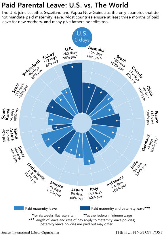
Many developed nations provide paid maternity leave to their female employees. This is not the case for the United States.

According to this visualization by the Huffington Post, the UK provides the highest number of paid maternity leave days, 280 with 90% pay. Brazil, China, France, Germany, India, Indonesia, Mexico, Netherlands, Russia, South Korea, and Spain, offer maternity leave with 100% pay.

In the U.S., parents are guaranteed their jobs for 90 days while on maternity or paternity leave, but without pay. Other countries that do not provide paid maternity leave include Lesotho, Swaziland, and Papua New Guinea, all developing nations.


Life Expectancy at Birth for Women

Life expectancy at birth, for women, varies significantly across the world.

On one side of the spectrum, we find nations where the life expectancy at birth for females is 80.5 years or more. Countries in this group include the United States, Canada, Chile, several developed nations in Northern, Southern and Eastern Europe, Australia, New Zealand, Japan, and South Korea.

On the other side, we find nations where the life expectancy at birth for females is much lower, 62.0 years or less. This group is comprised by the majority of African countries, with the exception of North African nations, and Afghanistan.

Resource: The World Bank DataBank: Gender Statistics – Life expectancy at birth, female (years)


Mortality Numbers for Children Under Five

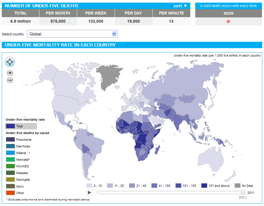
In 2011, 6.9 million children under five years old died around the globe from different causes ranging from pneumonia, malaria, diarrhea, HIV/AIDS, meningitis, to all kinds of injuries.

The number of deaths of children under five has decreased by 59% in the last forty years, from 16.9 million back in 1970 to 6.9 million in 2011. That is good news for the world in general; however, there are still regions in the planet where under-five mortality rates have changed hardly at all. That is the case of Africa, where countries with the highest under-five mortality rates include Sierra Leone, Somalia, Mali, Chad, Democratic Republic of the Congo, Central African Republic, Guinea-Bissau, and Angola. In other parts of the world, countries with high under-five mortality rates include Afghanistan, India, Pakistan, Papua New Guinea, Haiti and Bolivia.

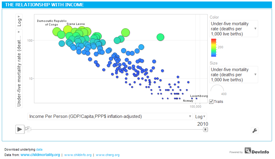
Income is a critical factor influencing under-five mortality rates, as shown in the graph above. The larger the income per capita of a nation, the lower the mortality rate. Such is the case of developed economies like Luxembourg or Norway, in stark contrast with developing countries like Somalia or Sierra Leone, where income per capita is very low.

Source: Health Intelligence: Under-five Mortality dashboard


Food Exports and Imports Worldwide

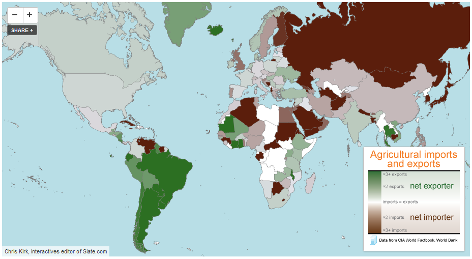
Some countries are net exporters of food (their food exports are larger than their food imports) while others are net importers of food (their food imports are larger than their food exports).

Among the net exporters of food we find the majority of South American countries, with the exception of Venezuela and Suriname, the United States, Canada, Mauritania, Indonesia, Australia, and a few African countries such as Mauritania, Ivory Coast and Ghana. The largest net exporter of food, by far, is Argentina with $23.42 of food exports per every $1.00 of food imports. Argentina is followed by Brazil, New Zealand, Paraguay and Iceland.

Among the net importers of food we find countries such as Russia, Finland, Sweden, the UK, Italy, Germany, Portugal, Sudan, Cuba, Saudi Arabia, Japan, etc. The largest net food importer is Eritrea, with $0.01 of food exports per every $1.00 of food imports. Eritrea is closely followed by Venezuela, Turkmenistan, and Algeria.

Data for for both agricultural exports and imports are for 2010.

Source: Slate.com: Maps: Agriculture in the U.S. and Around the World


Sweet Deal: The Global Trade of Chocolate

click to enlarge

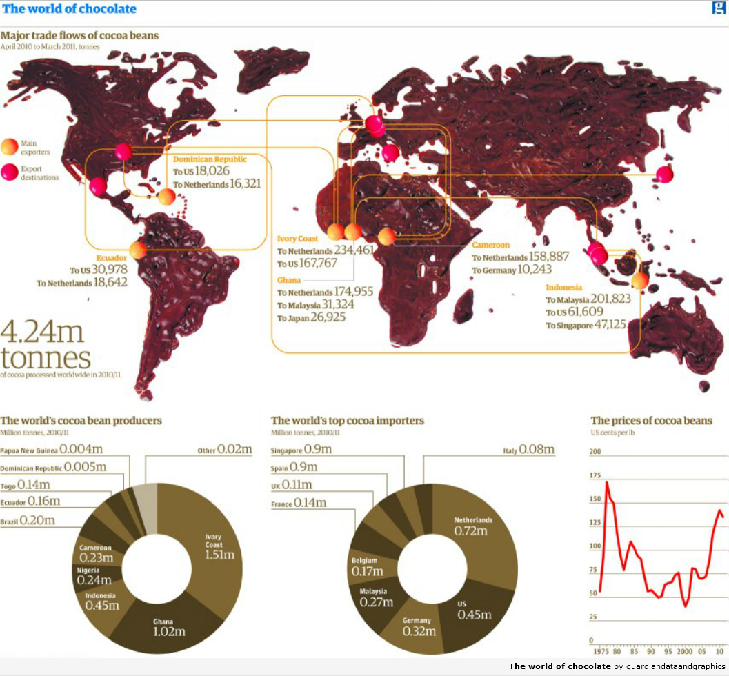
This visualization by The Guardian, actually made out of real chocolate, depicts the world trade (exports and imports) of chocolate. Between 2010 and 2011, 4.24 million tons of cocoa beans were processed worldwide.

The top cocoa bean producers are: Ivory Coast, Ghana, Indonesia, Nigeria, Cameroon, Brazil, and Ecuador, among others. The top importers include: Netherlands, the United States, Germany, Malaysia, Belgium, France, the UK, and Spain.

For a list of the top global confectionery companies, visit: International Cocoa Organization: The Chocolate Industry


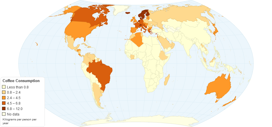
Coffee Consumption Per Capita Worldwide

Coffee production and consumption is believed to have originated in Africa, more specifically in the province of Kaffa, Ethiopia. In the fifteen century it was already present in the Middle East. From there it spread to Italy and then to the rest of Europe. From Europe it traveled to the New World, where it was first cultivated in the Caribbean island of Martinique. During the first quarter of the eighteen century it was brought to Colombia and Brazil.

Coffee is an important cash crop in many developing countries. It is also an important commodity traded in major commodity exchanges around the world. The largest coffee producers include: Burundi, Ethiopia, Rwanda, Honduras, Uganda, and Nicaragua among others.

According to ChartsBin, coffee consumption around the world is estimated at 1.3 Kilograms per person per year (a total of 7,358,897 metric tons). In the map above, we can see that the countries with the largest coffee consumption per capita include: Finland (12 Kg. per person per year), Norway, Iceland, Denmark, Netherlands, Switzerland, followed by Canada, Germany, Brazil and other western European nations.

Sources:


We Live Longer

click to enlarge

Average global life expectancy is now 70.4 years; 73.3 for women and 67.5 for men.

Life expectancy has gone up significantly in places like Iran, Bangladesh, the Maldives, South America and Africa, where the increase has been of 13 years or more, compared to previous decades. North America, Western Europe and Australasia have seen a modest increase of 7 plus years.

The rise in life expectancy has been possible thanks to the improvement in health programs and the control/cure of many infectious diseases that ended up in death, especially in young children.

But, there are places where the rise has been negligible like Eastern Europe, with an average increase of just 1 year. Other places have even experienced a decline in life expectancy. Such is the case of Lesotho and Belarus, which have seen a rise in HIV and alcoholism, respectively.

According to a report published by The Lancet, although we live longer now, the quality of life has declined due to the rise in obesity and its consequences: diabetes, high blood pressure and heart conditions.

Resources:


Vulnerability to Climate Change

The Global Adaptation Institute (GAIN) created the GAIN Index to measure the vulnerability of countries to climate change, combined with how well prepared these countries are to face the global challenges associated with it.

Countries at extreme risk include North Korea, the Democratic Republic of Congo, Iraq, Burundi, Chad, Sudan and Zimbabwe. At the other end of the spectrum, countries with the lowest risk include Denmark, Australia, Switzerland, Norway, the UK, New Zealand, Norway, to name a few.

For a complete list of countries and index methodology visit: The Global Adaptation Institute: The GAIN Index


The Most and Least Peaceful Countries

click to enlarge

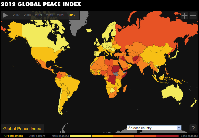
Vision for Humanity has compiled the Global Peace Index (GPI) for 2012. The GPI is a composite index that measures the peacefulness of countries around the world. It considers 23 weighted quantitative and qualitative indicators such as perceived criminality in society, access to weapons, imports of weapons, military expenditure, homicides, political instability, jailed population, weapons exports, violent crime, among others.

The lower the score, the more peaceful the nation. I that context, the most peaceful country is Iceland, followed by Denmark, New Zealand, Canada and Japan. On the other end of the spectrum, the least peaceful country is Somalia, followed by Afghanistan, Sudan, Iraq and the Democratic Republic of Congo.

The interactive map can be found at: Vision of Humanity: 2012 Global Peace Index

For detailed information about the GPI and its methodology, visit: Institute for Economics and Peace: Global Peace Index 2012