Category Archives: Charts

The World as 100 People

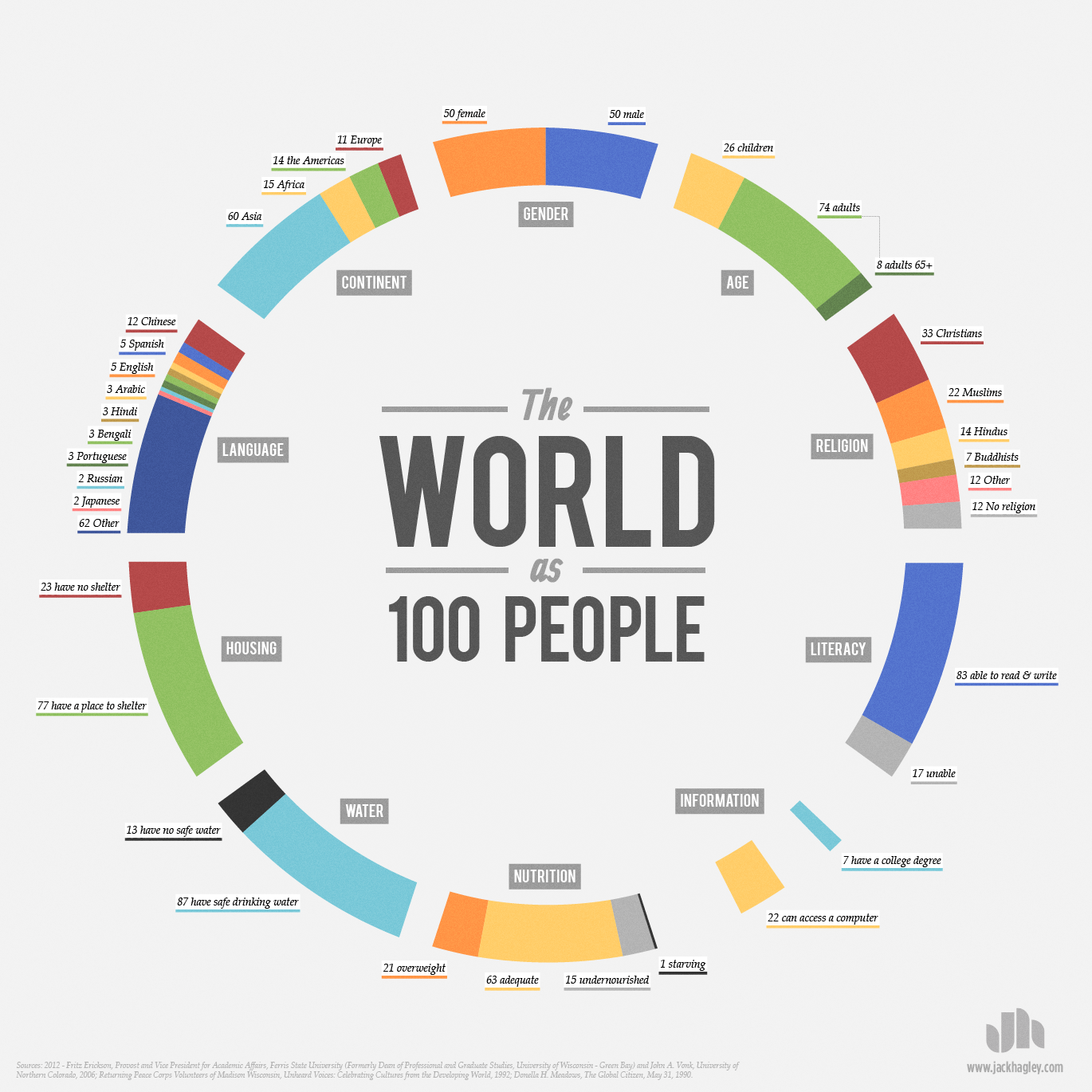
In this interesting infographic, created by Jack Hagley, we take a look at the world as if the total population of the world was 100 people. The information presented covers topics such as the distribution of gender, information, spoken languages, literacy, religion, age, housing, water, nutrition, and population inhabiting each continent.

 

Drone Attacks Visualized

click to enlarge

The use of drones to eliminate enemy targets has become routine practice for U.S. military operations since 2004, specially in Afghanistan and Pakistan.

Pitch Interactive has created the visualization above, showing the number of drone attacks since 2004 to date, as well as the number of casualties. Of an estimated 3,105 casualties, 175 were children (5.6%), 535 were civilians (17.2%), and 2,348 (75.6%) were casualties classified as other, which can include male able-bodied enemy combatants, their neighbors, and possible militants.

Data for this visualization was obtained by Pitch Interactive from the Bureau of Investigative Journalism,  the New America Foundation, and Living Under Drones.


Paid Maternity Leave Worldwide

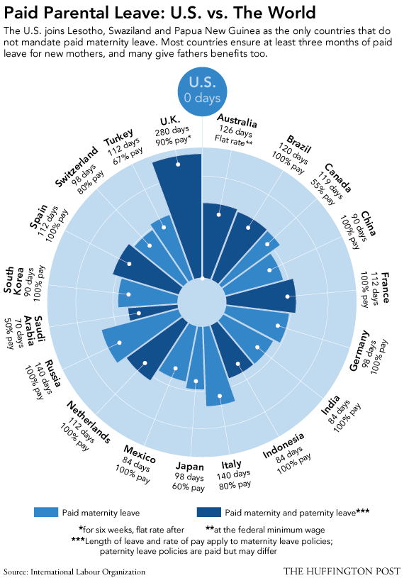
Many developed nations provide paid maternity leave to their female employees. This is not the case for the United States.

According to this visualization by the Huffington Post, the UK provides the highest number of paid maternity leave days, 280 with 90% pay. Brazil, China, France, Germany, India, Indonesia, Mexico, Netherlands, Russia, South Korea, and Spain, offer maternity leave with 100% pay.

In the U.S., parents are guaranteed their jobs for 90 days while on maternity or paternity leave, but without pay. Other countries that do not provide paid maternity leave include Lesotho, Swaziland, and Papua New Guinea, all developing nations.


U.S. Military Personnel Around the World

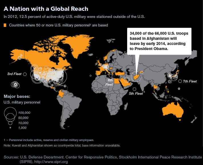
According to this map by Bloomberg, in 2012 approximately 12.5% of active-duty military personnel were stationed outside the United States, in places like Afghanistan, Turkey, Australia Canada, Greenland, Colombia, Guatemala, Honduras, Egypt, Myanmar, South Korea, Greece and Western Europe.

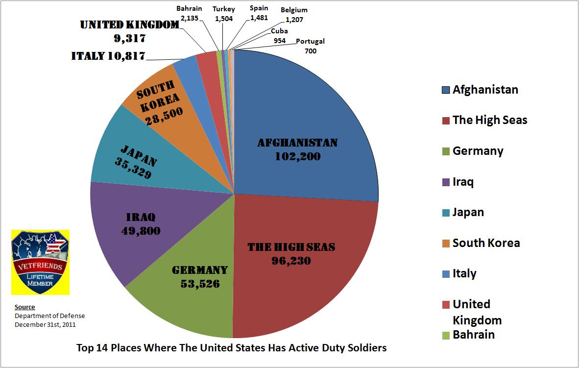
The pie chart above shows the top 14 places where the U.S. has active duty soldiers stationed.

Resources:


Global Vitamin D Deficit

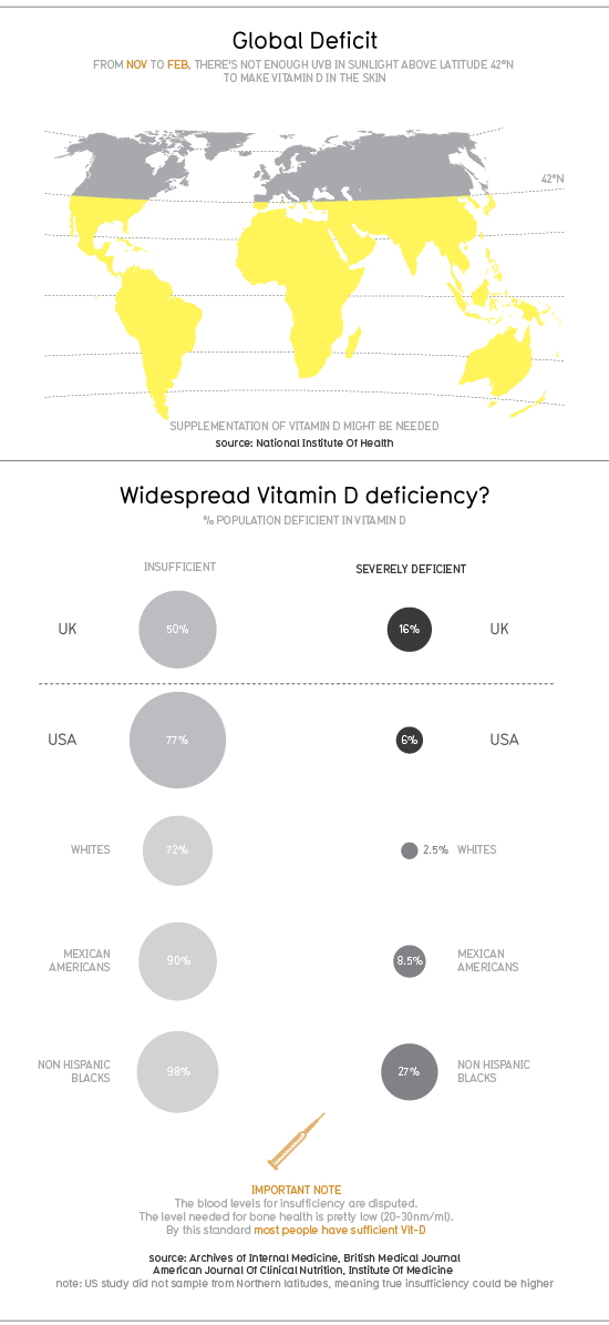
According to a 2010 infographic by Information is Beautiful, people inhabiting in the Northern hemisphere, more precisely above latitude 42°N, are not getting enough UVB light from sunlight to make vitamin D in the skin during winter season.

In the UK, 50% of the population has insufficient levels of vitamin D, while 16% of the population is severely deficient. In the United States, 77% of the population has insufficient levels of vitamin D, while 6% of the population is severely deficient. Within the U.S., the groups more affected by insufficient levels of vitamin D are Non-Hispanic blacks (98%) and Mexican Americans (90%).

To try compensate for the lack of UVB light in winter time and the consequent low vitamin D levels, consumers have turned to the vitamin D industry, an industry that is worth $460 million, as of 2009, in the U.S. alone.

For more graphics and statistics, visit: Information is Beautiful: Vitamin D

Ways of Transportation in Six Selected Cities

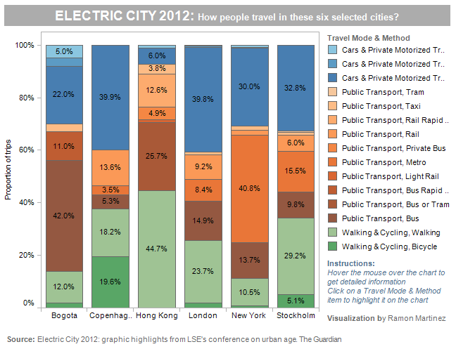
Interesting transportation patterns emerged from the 2012 LSE Cities conference, which focused in the way cities across the globe adjust to technological innovation and environmental changes.

The graph above displays transportation patterns for six selected cities: Bogota, Copenhagen, Hong Kong, London, New York, and Stockholm. Of the six selected cities, Hong Kong is where walking and biking are the most common ways of transportation, a good 44.7%, and where cars and other private motorized vehicles are used the least (7.2%). Copenhagen and London, are the cities where the most common way of transportation are cars and other private motorized vehicles (39.9% and 39.8% percent respectively). New York city and Bogota are the cities where public transportation is most commonly used (57.9% and 56% respectively). In Stockholm, all three ways of transportation (walking/biking, private cars, and public transportation) are used almost in similar proportion.

For more detailed information visit:


Religious Beliefs Around the World

click to enlarge

Religion plays an important role in every culture around the world. This amazing visualization of world religions by the National Post, shows the origins of different religious beliefs and how they are spread around the globe. The world’s population fall into the following main belief groups: Abrahamic (Christian, Judaic, Islamic, and Baha’i faiths), Eastern Dharmic (Buddhist, Hinduist, Sikh, and Ayyavazhi faiths), East Asian (Chinese folk religions, Japanese Shinto, and Vietnamese religions), Secular (Irreligious, Atheist, and Agnostic), and Indigenous (practiced by indigenous people in different regions of the globe).

The Abrahamic and Eastern Dharmic religions are by far the ones with the largest constituencies, 48% and 19% of the population respectively. The secular/agnostic/atheist group is the next largest constituency, 17% of the world’s population.


The Gun Lobby in the U.S.

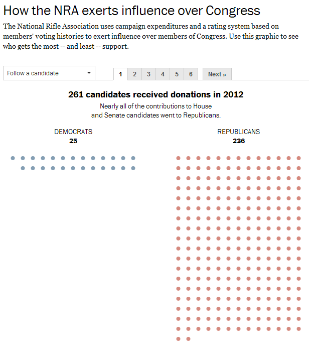
While the debate goes on in Congress regarding gun control, it is interesting to see that many members of Congress that will be voting on the issue, received donations from no other than the National Rifle Association (NRA). On the graphic above, compiled by the Washington Post, we can see that the party that benefited the most from NRA donations in 2012 was the Republican party.

Recipients of NRA donations are selected by the NRA based on a grading system that includes how a particular Congress member supported the NRA on gun issues in the past.

For the interactive graphic that allows you to check for names of candidates that received financial contributions by the NRA visit: The Washington Post: How the NRA exerts influence over Congress


Countries With the Largest Gold Reserves

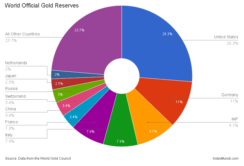
According to a World Gold Council report, world official gold reserves are estimated to be 31,575 tonnes as of January 2013. The United States ranks number one in official gold holdings with 8,133 tonnes. It is followed by Germany, the IMF (International Monetary Fund), Italy, France, China, Switzerland, Russia, Japan and the Netherlands. All other countries combined hold 7,325.5 tonnes in gold reserves. The countries in that group include India, Taiwan, Portugal, Venezuela, Saudi Arabia and Turkey. The Euro area holds 10,783 tonnes in gold reserves.

Resource Investor reports that central banks increased their official gold holdings to 500 tonnes in 2012 from 465 tonnes in 2011.

Resources:


The Best and Worst Places to be Born in 2013

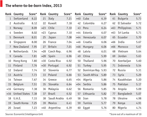
Back in 1988, the United States was ranked first as the best country to be born. Twenty five years later, the U.S. is ranked number 16.

The Economist Intelligence Unit compiled the where-to-be-born index which measures which country will provide the best opportunities to someone born in 2013. It links the results of life satisfaction surveys to indicators that affect the quality of life in those countries, such as geography, demographics, culture, government policies, the economy, etc.

Based on those factors, the best places to be born are Switzerland, Australia followed by Norway, Sweden Denmark, and Singapore. At the bottom of the list you will find Nigeria, Kenya, Ukraine, Bangladesh, Angola, Pakistan, among others.