Category Archives: Countries

Migrant Remittances Continue to Rise

click to enlarge

click to enlarge

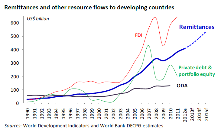
Migrant remittances to developing countries are expected to reach $406 billion in 2012, a 6.5 percent increase over the previous year, and $534 billion in 2015. These officially recorded remittances have kept increasing despite high remittance costs and the financial crisis. This source of income for developing economies constitutes more than three times the size of Official Development Assistance (ODA).

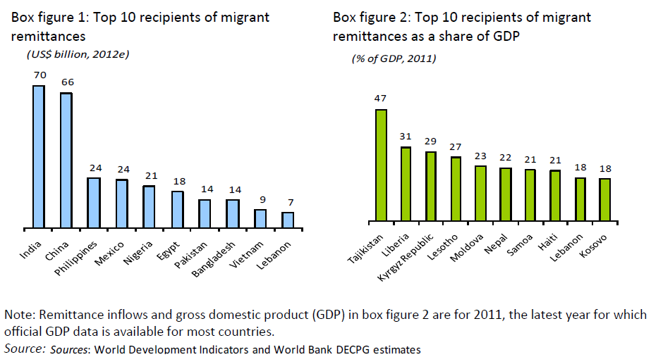
The highest recipients of migrant remittances among developing economies for 2012 are India, China, the Philippines and Mexico. As a percentage of GDP, the highest recipients in 2011 were Tajikistan, Liberia, the Kyrgyz Republic and Lesotho.

Resources:


More Plastic in the Pacific Ocean

click to enlarge

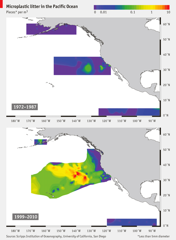
The amount of plastic pollution in the North Pacific Subtropical Gyre (NPSG), more often referred to as the North Pacific Garbage Patch, has increased dramatically in the last forty years, according to this map by The Economist. The plastic pieces 5mm in diameter or less, known as ‘microplastic’, are known to have an impact on the ocean’s ecosystem, mainly through ingestion of these particles by fish and invertebrates. The species that seems to be benefiting from the presence of the microplastic debris is the insect known as Halobates sericeus, that has way more surface where to lay its eggs. For detailed information see the complete research paper: Increased Oceanic Microplastic Debris Enhances Oviposition in an Endemic Pelagic Insect by Miriam C. Goldstein,
Marci Rosenberg, and Lanna Cheng.


Political Polarization in the US

US Presidential election results in North Carolina 1996-2012

As we start analyzing the results of the 2012 presidential election in the US, it is becoming clear that political polarization continues to increase across the country. Take North Carolina for instance. As the thematic maps above show, the number of counties where the Republican party won by 40% or more reached a new high in 2012. This year there were 14 deeply red counties, compared to only 4 in 2008. On the other hand, there were 10 deeply red counties in 2004, which suggests that 2008 was an outlier due to the extraordinary circumstances that allowed Obama to win the state.

The Wild Wild Weather

click to enlarge

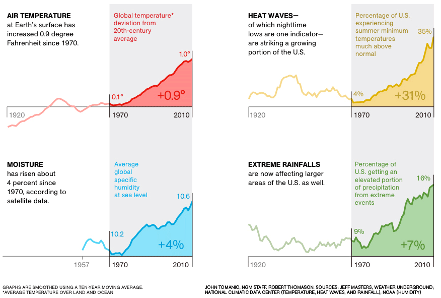
Temperatures on the Earth’s surface and moisture levels in the atmosphere have been on the rise. These two factors might be at the root of the drastic change in weather patterns causing severe droughts, heat waves, heavy rains and other extreme weather phenomena.

In its September 2012 edition, the National Geographic magazine featured an extensive article on extreme weather affecting the U.S.


Billion Dollar Weather Disasters

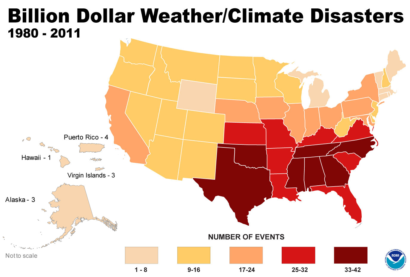
Billion dollar weather events by state

As the economic damage from Hurricane Sandy is still being evaluated, we took a look at the damage from weather/climate-related disasters over the past 30 years. The National Climatic Data Center (NCDC) at the National Oceanic and Atmospheric Administration keeps detailed statistics of all weather disasters in the US. One of the visualizations the NCDC has created is a thematic map of billion-dollar weather events, which can be seen above. The map shows the number of events that caused at least a billion dollars in damage by state. Southern states suffered the most damage up until 2011. The colors in the map may look significantly different once the total tally of Sandy is calculated.

The World’s Least and Most Dynamic Countries

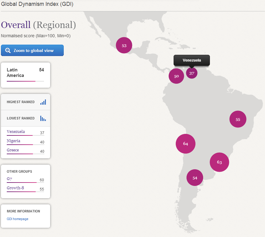
Global Dynamism Index

Grant Thornton International and the Economist Intelligence Unit have just released a Global Dynamism Index, which ranks 50 economies on 22 indicators of dynamism. Countries which have a positive reading on these indicators have recovered faster since the 2008 global recession, and are also on a path to higher future growth. Singapore, Finland, and Sweden are at the top of the list of the world’s most dynamic countries, whereas Nigeria, Greece, and Venezuela are at the bottom.

First Names and Politics

An analysis of donor data from the Federal Election Commission (FEC) conducted by Chris Wilson at Yahoo News suggests that first names may be a predictor of a person’s political affiliation. It turns out that Republicans seem to have a hold on names like Donald and Sharon, whereas Democrats attract contributions from people with names like Angela and Willie. You can play around with the data and draw your own conclusions using the embedded chart.

Cigarette Smoking Rates Around the World

click to enlarge

A color-coded map featured in an article by the Washington Post, shows annual per capita smoking rates by country. Serbia, Russia, and other countries in Eastern Europe, are the heaviest smokers, with an average consumption of 2,000 cigarettes per person per year. These countries are followed by Japan and South Korea, with China catching up. The U.S. and Canada are in the middle with an average consumption of 750 to 1,249 cigarettes per person per year. The healthiest countries tend to be poor countries located in Sub-Saharan Africa and in Southeast Asia, with an average consumption of up to 250 cigarettes per person per year.

Related Links:

  1. Kremlin Cracks Down on Big Tobacco – World Smoking Habits Data [Wall Street Journal]
  2. Key Facts About Smoking – [American Lung Association]


Megacities Around the World

click to enlarge

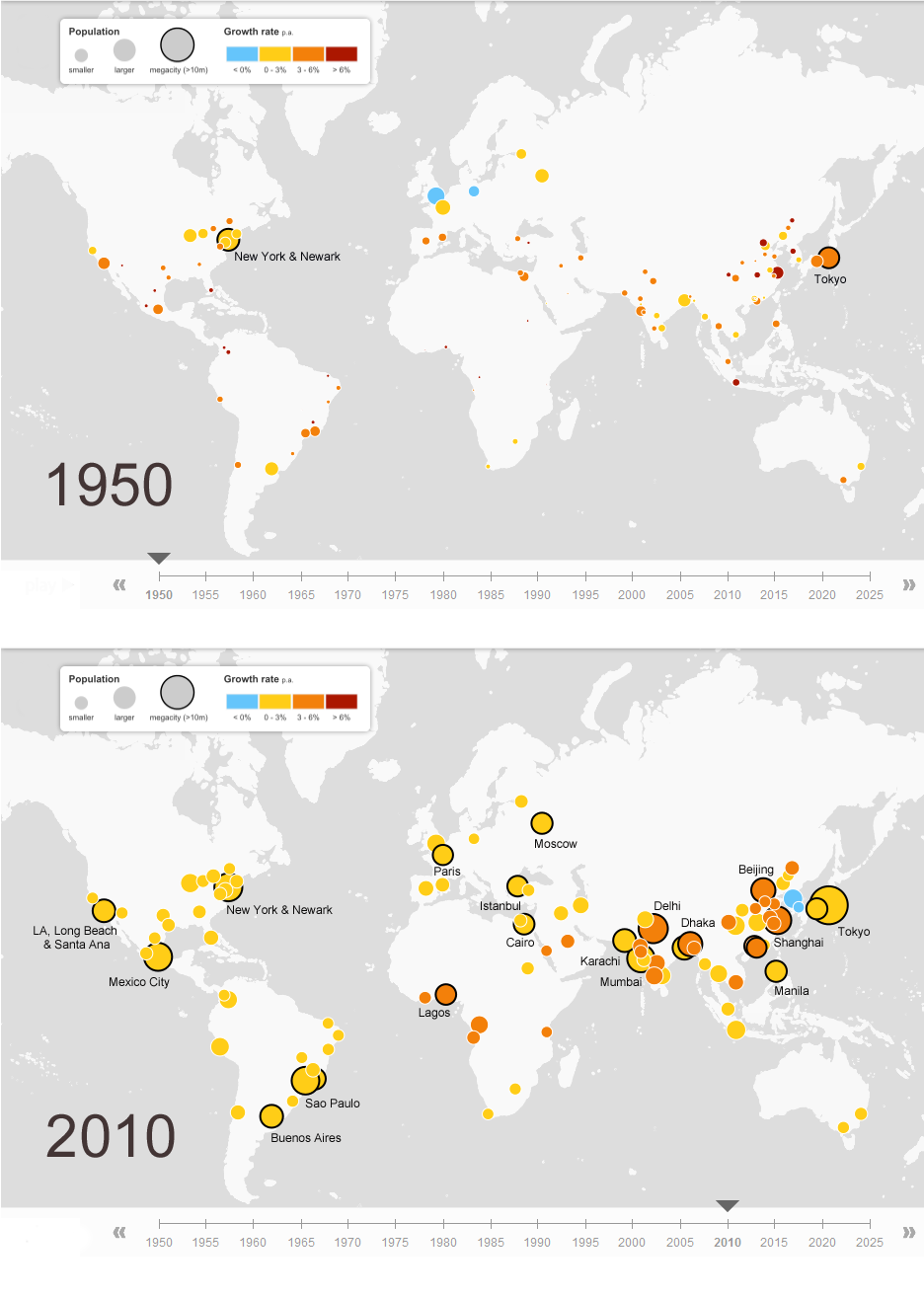
Back in 1950, New York and Tokyo were the only two megacities, with populations larger than 10 million inhabitants. By 2010 the number of megacities had increased to 23, including cities like Mexico City, Los Angeles, Sao Paulo, Rio de Janeiro, Buenos Aries, Paris, Moscow, Cairo, Istanbul, Delhi, Karachi, Mumbai, Dhaka, Beijing, Shanghai, Manila, besides New York and Tokyo, the largest megacity with a population of 36.9 million. For 2025, it is estimated that there will be 29 megacities around the globe. Click here for the interactive map.


The Congested Skies of America

This interesting animation shows air traffic over the United States on a given day. It was created using real air traffic data from the Federal Aviation Administration (FAA). The animation covers the period 8PM to 8PM EST of the following day. In the middle of the night, the number of aircraft on the air is about nine hundred. In the middle of the day, the number of aircraft on the air is around five thousand. Most air traffic is concentrated in the Northeastern part of the country and the main traffic hubs can be distinguished by the number of aircraft concentrated around them.