Category Archives: Countries

Great News: Americans Smoke Less

click to enlarge

According to an article published by Scientific American, based on data from the Center for Disease Control and Prevention (CDC), tobacco use decreased in the U.S. in 2010, comparing to 1995. There are still some states where the use of tobacco constitutes a severe problem. Such is the case of West Virginia and Oklahoma. The best state in terms of tobacco use is Utah, with the lowest levels nationwide.


U.S. States Get More Drunk

click to enlarge

According to an article published by Scientific American, based on data from the Center for Disease Control and Prevention (CDC), heavy drinking has increased in several states. The heaviest drinking states are located in the Northeast, the worst of all Vermont, based on data for 2010. Heavy drinking is defined as two or more drinks per day for men, and one or more drinks per day for women.


The United States as Mapped by Starbucks Locations

click to enlarge

In a thought-provoking article, James Davenport from the blog IfWeAssume.com, mentions interesting facts about the location of Starbucks coffee shops in different cities in the U.S. For example, the closer you live to a Starbucks, the more likely your rent is going to be higher. Another interesting fact is that Starbucks locations are clustered around major cities and highways, as shown in the map. He concludes that more than 80% of the U.S. population, about 250 million people, live within 20 miles of a Starbucks.


Youth Unemployment in Europe and the US

Youth unemployment in Europe and the US

A new report from Eurostat shows that the economic crisis in Europe is creating rising unemployment throughout the continent. The 25 years old and under age group has been the hardest hit by a wave of layoffs and by the reluctance of firms to hire. In Greece and Spain, youth unemployment has risen above 50%, a level which has been fueling mass protests and even violence. Check the article at The Atlantic for a more detailed discussion about the graph above.

Income Distribution by Religious Belief Groups

Click to enlarge

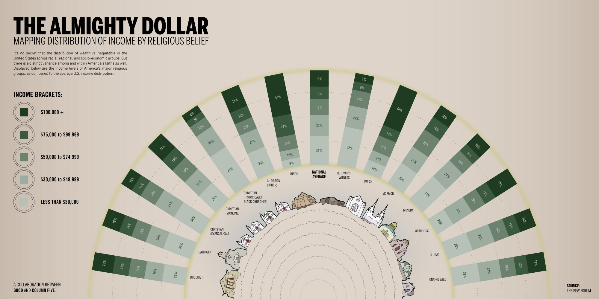
This infographic by GOOD shows the income distribution according to different religious belief groups. It is interesting to notice that 43% of people with Hindu beliefs earn an average income of 100K or more. For people with Jewish beliefs the percentage is 46%, compared to 21% for people with Christian beliefs (mainline), and 8% for people with Christian beliefs (Black churches). Click on the image for more detail.


Of Beer and Politics

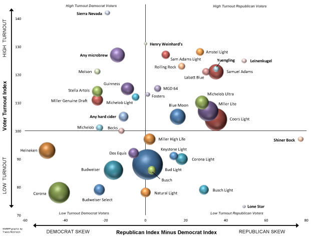
According to an article published by the National Journal, the brand of beer you drink is related to how you will vote in the upcoming elections. If you like Coors Light or Samuel Adams, you are likely to vote Republican. On the other hand, if you like Heineken or Guinness, you are likely to vote Democrat. Dos Equis and Bud Light are beer brands liked on both sides of the aisle.

Related links:


How Many of Gallons of Gas Can You Purchase With Your Weekly Income?

Click to enlarge

The average weekly income in the US has been going up in the last fifty years, at least in nominal terms, as seen in the first graph. The price of a gallon of gas has been trending up as well, with spikes beginning in 2002 up to 2008, when gas prices decreased dramatically as a consequence of the economic recession. In 2010 gas prices increased again and continue rising to this day, as seen in the second graph. It is worth noting that the number of gallons of gas that can be purchased by a person earning an average income has been decreasing steadily since 1998.


Housing Market: Home Prices are Up!

The latest numbers for the S&P/Case-Shiller House Price Index, just released, show an increase in home prices for twenty major cities in the United States. Both the 20-City Composite and 10-City Composite show similar trends, the first with a 1.6% increase and the second with a 1.5% increase for the month of July 2012. This numbers constitute a second year-over-year rise, following a decline in 2010 caused by the end of the Housing Stimulus package in April of that same year.


Life Expectancy vs. Fertility Rates Worldwide 1960-2010

click to enlarge

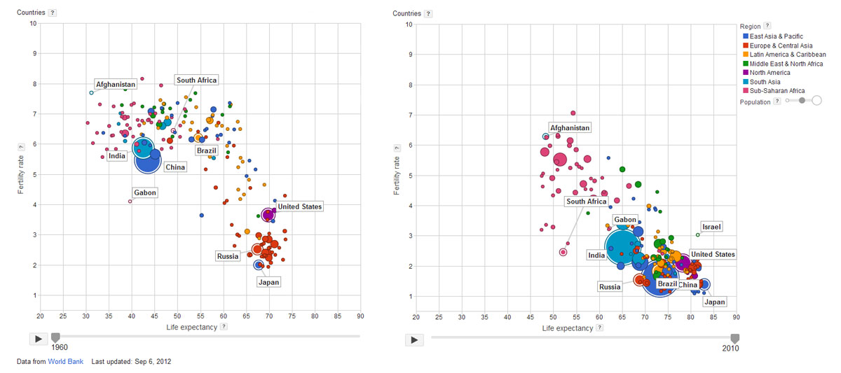
During the last fifty years, we have seen the gradual increase in life expectancy and the corresponding decrease in fertility rates worldwide. This is clearly the case of countries like China, India, the United States, Brazil, Japan, and Gabon, where dramatic improvements can be seen. On the other hand, countries like Russia, South Africa and Afghanistan, show moderate improvement.

It is very interesting to note, that although they have improved, a large cluster of African countries remain far from the overall trend, with lower life expectancy rates and higher fertility rates. For more information, check Google’s interactive bubble chart based on World Bank data.


How Does Your Country Compare to U.S. States?

These interactive maps from the Economist provide an interesting comparison between different countries and US states.

Using the criteria of GDP (Gross Domestic Product), the economy of California is approximately the size of Italy, Texas the size of Russia, Florida the size of the Netherlands, and Alabama the size of Nigeria.

Using the criteria of Population, California is approximately the size of Poland, Washington  the size of Lebanon, Arizona the size of Libya, and Minnesota the size of Finland, to name a few.