Category Archives: Countries

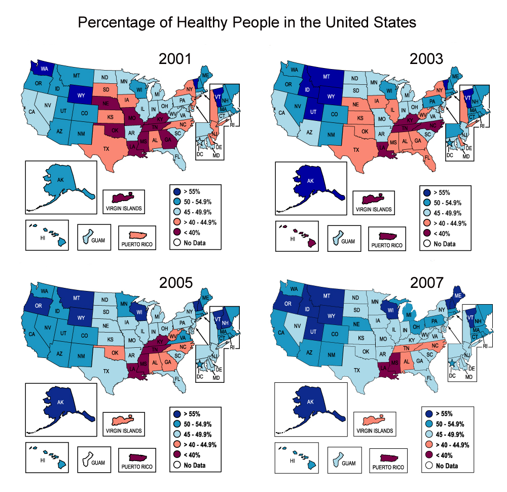
Do You Live in a “Healthy” State?

According to data from the Center for Disease Control and Prevention (CDC), most states have become healthier in terms of physical activity for the years between 2001 and 2007, excluding Louisiana and Mississippi which have less than 40% of healthy residents.

The CDC defines as “healthy people” those who engage in moderate-intensity physical activity at least 5 days a week for 30 minutes a day, or those who engage in vigorous-intensity physical activity at least 3 days a week for 20 minutes a day.

It is interesting to note, though, that data displayed on these maps tells a different story than data for the obesity rate in the United States. As we showed on a previous post, the obesity rate in the U.S. has been rising steadily since at least 1991. There is a clear contradiction between the rise in obesity rates and the rise in the percentage of healthy people.


Industrial Production, Producer Prices and Consumer Confidence

Industrial production is up for the month of July, with a 0.6% increase. So is the core Producer Price Index (excludes energy and food) with an increase of 0.4%. Consumer confidence varies from state to state, with optimistic states located around the District of Columbia area and the Midwest, and pessimistic states mostly in the southern part of the country. Read below:

  1. Three Numbers to Watch: US Industrial Production,CPI; UK Unemployment – Yusuf Yassin [TradingFloor.com]
  2. Industrial Production Climbs 0.6% in July – Steve Goldstein [Market Watch]
  3. Producer Prices Come In A Bit Higher Than Expected – Sam Ro [Business Insider]
  4. Consumer Confidence Varies from State to State – Interview with Frank Newport [Marketplace]
  5. U.S. Durable Goods Orders Drop in June – Agence France-Presse [IndustryWeek]

Visualizing Presidential Election Results

Presidential election results for North Carolina counties 1996-2008

As we get closer to the 2012 presidential elections in the U.S., we are taking another look at the results of past elections to see if we can discern any patterns. Our first attempt consists of visualizing the margin of victory of each major party in the state of North Carolina. The map above shows the county by county results for the past four elections (click on the map for a larger version). Counties shaded red were won by the Republican party, while counties shaded blue were won by the Democratic party. Deeper shades are used to represent counties where the margin of victory was relatively large. Take Yadkin county for example. In 1996 it was the only county in the state where the Republicans won by over 40%, hence its deeper red color. Note that counties where the margin of victory was less than 5% are colored white.

For those of you wondering how we created the map, we used the IndexMundi thematic map creator. The election results data came from the North Carolina State Board of Elections.

Obesity in America: An Upward Trend

Obesity Trends Among US Adults 1991-2010
(BMI ≥ 30 lbs, or 30 lbs overweight for 5’4″ women)

Obesity has increased dramatically in the last twenty years. Mississippi has the highest percentage of obese adults, 34.9 %, followed by other twelve states with percentages higher than 30%. Most of these states are located in the Midwest and South. Is your state among the “fattest” states? Read more:

  1. STUDY: Mississippi Is The Fattest State – Ian Simpson, Reuters [Business Insider]
  2. Obesity Related Statistics in America [Get America Fit Foundation]
  3. Obesity could affect 42% of Americans by 2030 – Nanci Hellmich [USA Today]
  4. Adult Obesity Facts [Centers for Disease Control and Prevention]
  5. Junk Food Laws May Be Answer to Kids’ Obesity, Study Says [Fox News Latino]
  6. Childhood Obesity Facts [Centers for Disease Control and Prevention]


Animated Map Visualizations

You can now explore 11 years worth of changes in the demographic characteristics of all U.S. counties through our animated map visualizations. Try the following indicators:

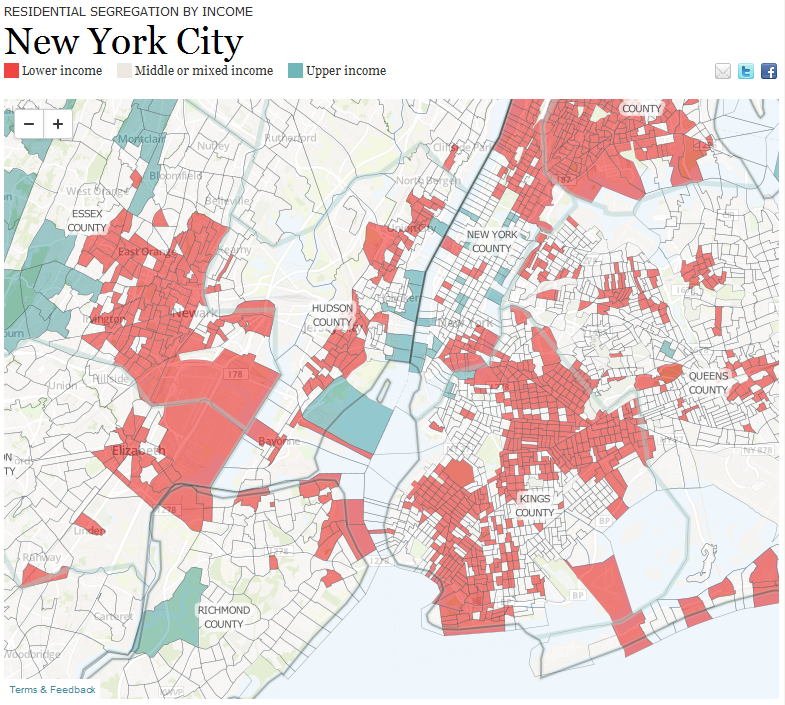
The Rise of Residential Segregation by Income

residential segregation by income

A new report by the Pew Research Center shows that residential segregation by income in the U.S. has increased during the past 30 years in 27 of the 30 largest major metropolitan areas. Check the report to find out details about your city. You can also click on the map above to see visualizations of income segregation for the largest metropolitan areas, e.g. New York, Los Angeles, Chicago, and Houston.