Category Archives: Europe

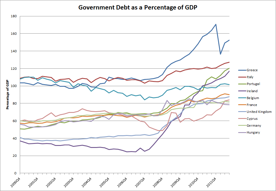
Government Debt as a Percentage of GDP

Government Debt as a Percentage of GDP

Using data from Eurostat, we identified the top 10 European countries with the highest government debt as a percentage of GDP. The chart above shows that as of the third quarter of 2012, the latest period for which quarterly data is available, Greece, Italy, and Portugal had the highest government debt ratio. Ireland was close behind Portugal, with a ratio that has been increasing at the fastest rate out of all the countries in the list. Cyprus, which has been in the news lately due to problems in its banking sector, had a debt ratio not much higher than Germany.

Source: Eurostat
Water Available Per Person Worldwide

click to enlarge

March 22, 2013 has been designated World Water Day by the United Nations. In that regard, we wanted to see how much water is available per person per day across the planet.

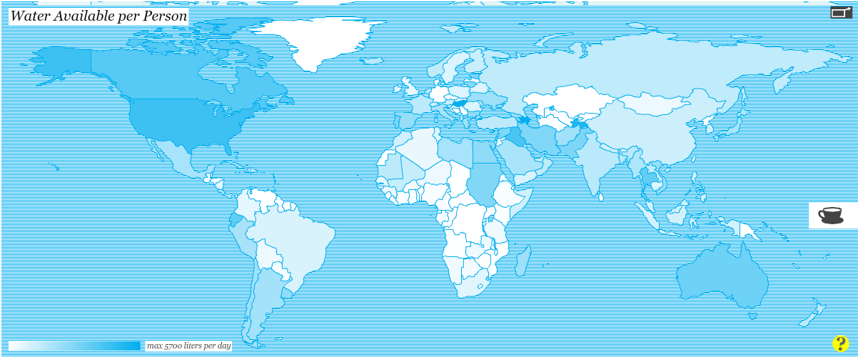
The map above, winner of the Urban Water Design Challenge for Interactive Water Footprint Infographic at Harvard University, shows how much water is available for each person in a single day in each country.

Countries with the largest amount of water available per person per day (dark areas) include: the United States (4,382 litters/day), Canada (3,796 litters/day), and Ecuador (,3516 litters/day) in the Americas; Hungary (5,704 litters/day) in Europe; Azerbaijan (5,619 litters/day), Iraq (4,060 litters/day), and Tajikistan (5,033 litters/day) in Asia; Sudan (2,822 litters/day), and Egypt (2,527 litters/day) in Africa.

For the interactive infographic and other interesting visualizations about water, please visit: Circle of Blue: Harvard Students Win Urban Water Design Challenge for Interactive Water Footprint Infographic 

Forest Areas as a Percentage of Land Area Worldwide

March 21, 2013 has been declared the first International Forest Day by the United Nations. In that light, we decided to take a look at one key environmental indicator that measures the percentage of forest area present in different regions of the planet.

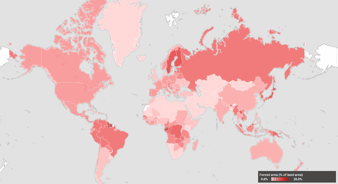
The map above, created by the World Bank depicts forest areas as a percentage of land area for each country. Forest area is defined as land, natural or planted, under groves of trees of at least 5 meters (productive or not), excluding tree groves in agricultural production systems.

Countries with the highest forest area as a percentage of land area (dark red areas) include: Guyana, Suriname, and Belize in the Americas; Finland and Sweden in Europe; Bhutan, Laos, Japan, South and North Korea in Asia; Guinea, Gabon, Democratic Republic of Congo, Congo, and Guinea Bissau in Africa; Papua New Guinea in Oceania.


Cancer Death Rates for Men and Women

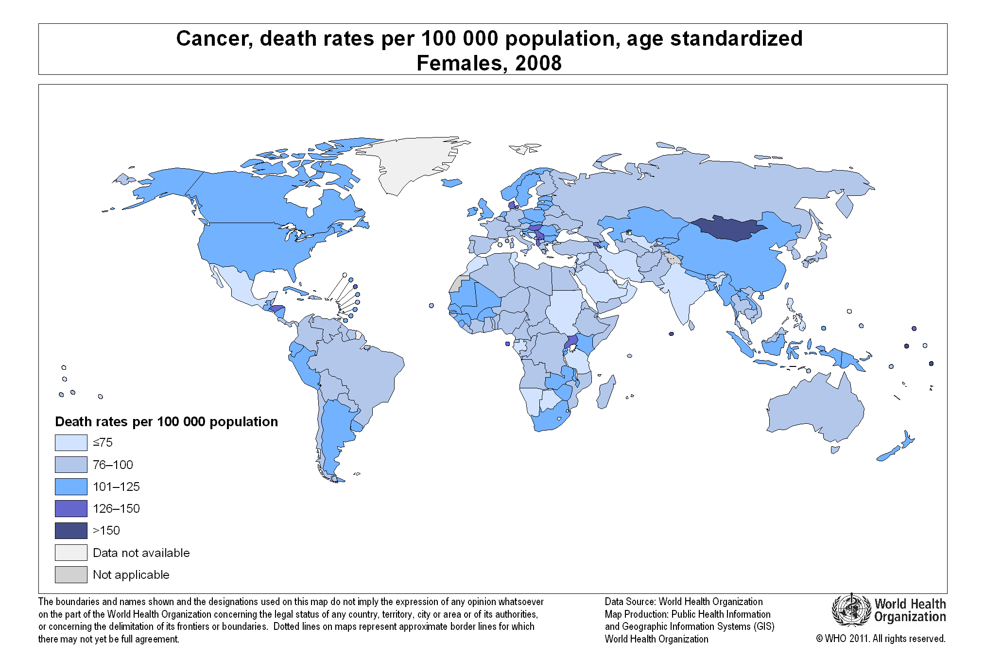
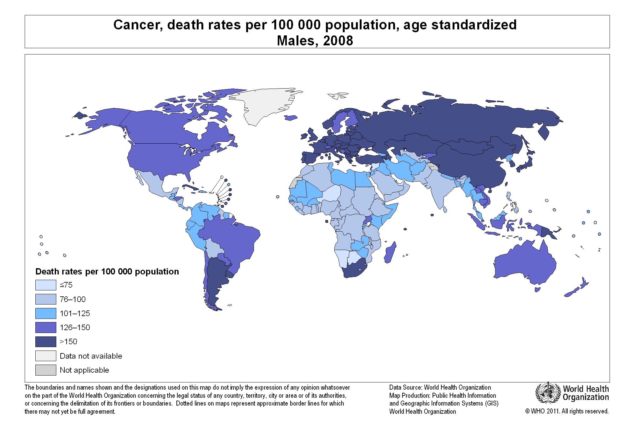
Cancer affects both women and men globally. However, cancer death rates are different for each gender, as can be seen in the two maps displayed in this article.

We find the highest cancer death rates for women (126 or more per 100,000 population) in Mongolia, Denmark, Albania, Macedonia, Uganda, and Honduras.

The cancer death rate for men is the highest (150 per 100,000 people) in most parts of the world, compared to women. Countries with high death rates for males include most European countries, Middle Eastern nations, Russia, Mongolia, Kazakhstan, China, Japan, South and North Korea, Turkey, South Africa, Argentina, Uruguay, and Cuba. Other countries with high death rates for males (126 or above per 100,000 people) include the United States, Canada, Brazil, and Australia.

We can only speculate about the factor behind this disparity in numbers of cancer death rates for men and women worldwide.

For detailed information, please visit:


Number of Doctors per 1,000 People per Country

The map above, created by the World Health Organization (WHO), shows the number of physicians per 1,000 people (for the latest available year) across the globe.

Countries with the largest number of physicians per 1,000 population include: San Marino (47.35), Cuba (6.72), Greece (6.17), Monaco (5.81) and Belarus (5.18).

Countries with the smallest number of doctors per 1,000 people include: Colombia, Nicaragua, Haiti, Liberia, Niger, sierra Leone, Rwanda, Ethiopia, Yemen, Afghanistan, Myanmar, Thailand, Cambodia, Indonesia, Papua New Guinea, etc.

Fossil Fuel Subsidies Globally

Fossil fuel subsidies are very common in developing nations. Subsidies cover the difference between the price at which fossil fuels are sold inside the country and their actual price in international markets, creating a huge fiscal burden (an estimated $400 billion annually) for the countries that provide them. Developing nations with fossil fuel subsidies include: Venezuela, Argentina, Ecuador, Algeria, Libya, Egypt, Kuwait, Iran, Pakistan, Russia, China, India, Indonesia, etc.

Developed nations also provide subsidies in the form of tax breaks to the oil industry and other measures (estimated at a cost of $45 to $75 billion per year). Nations in this group include many OECD (Organization for Economic Co-operation and Development) members.

For the interactive map, visit: National Geographic: The Great Energy Challenge: Fossil Fuel Burden on State Coffers


Expected Years of Schooling for Females Worldwide

The expected years of schooling for females varies from country to country.

Developed nations such as the United States, Canada, the UK, France, Germany, Norway, Iceland, Australia, New Zealand, etc., show the highest number of expected years of schooling (15 to 21 years) for girls. Other nations in this group include Argentina, Uruguay, Kazakhstan, Libya, and South Korea.

On the other hand, countries with the lowest number of expected years of schooling (0 to 8 years) for females include most African countries, Pakistan, Afghanistan, Iraq, Yemen, Myanmar, Bangladesh, and Papua New Guinea.

Resource: The World Bank DataBank: Gender Statistics – Expected years of schooling for females

Life Expectancy at Birth for Women

Life expectancy at birth, for women, varies significantly across the world.

On one side of the spectrum, we find nations where the life expectancy at birth for females is 80.5 years or more. Countries in this group include the United States, Canada, Chile, several developed nations in Northern, Southern and Eastern Europe, Australia, New Zealand, Japan, and South Korea.

On the other side, we find nations where the life expectancy at birth for females is much lower, 62.0 years or less. This group is comprised by the majority of African countries, with the exception of North African nations, and Afghanistan.

Resource: The World Bank DataBank: Gender Statistics – Life expectancy at birth, female (years)


U.S. Military Personnel Around the World

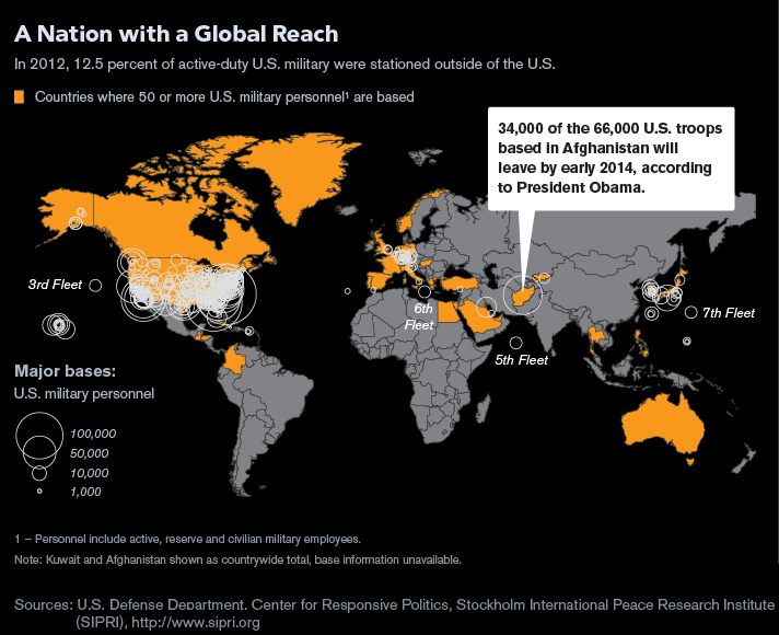
According to this map by Bloomberg, in 2012 approximately 12.5% of active-duty military personnel were stationed outside the United States, in places like Afghanistan, Turkey, Australia Canada, Greenland, Colombia, Guatemala, Honduras, Egypt, Myanmar, South Korea, Greece and Western Europe.

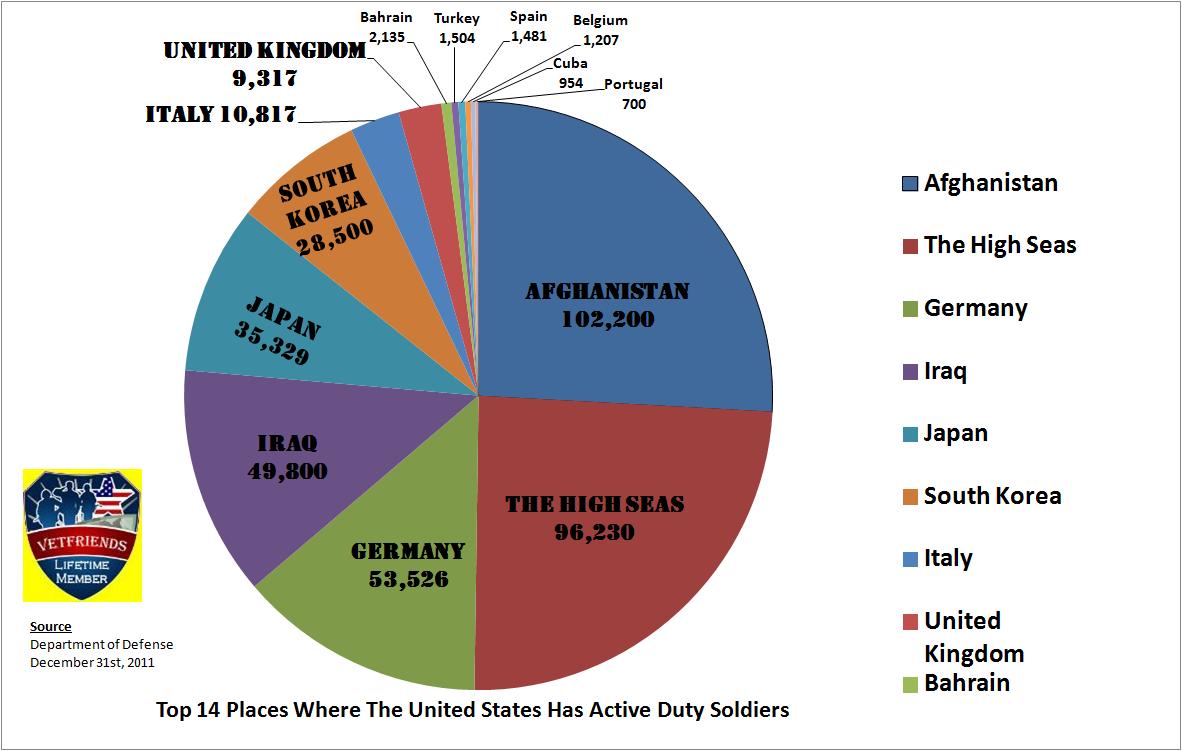
The pie chart above shows the top 14 places where the U.S. has active duty soldiers stationed.

Resources:


Global Vitamin D Deficit

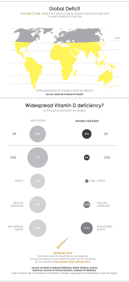
According to a 2010 infographic by Information is Beautiful, people inhabiting in the Northern hemisphere, more precisely above latitude 42°N, are not getting enough UVB light from sunlight to make vitamin D in the skin during winter season.

In the UK, 50% of the population has insufficient levels of vitamin D, while 16% of the population is severely deficient. In the United States, 77% of the population has insufficient levels of vitamin D, while 6% of the population is severely deficient. Within the U.S., the groups more affected by insufficient levels of vitamin D are Non-Hispanic blacks (98%) and Mexican Americans (90%).

To try compensate for the lack of UVB light in winter time and the consequent low vitamin D levels, consumers have turned to the vitamin D industry, an industry that is worth $460 million, as of 2009, in the U.S. alone.

For more graphics and statistics, visit: Information is Beautiful: Vitamin D