The Economic Freedom Index 2013

economic freedom index

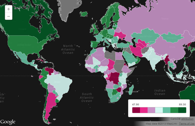
The Economic Freedom Index, compiled by the Heritage Foundation, is a measure of the economic freedom given to citizens in each of the 185 countries where it is measured. A total of ten components of economic freedom are considered, all grouped under four categories: rule of law, limited government, regulatory efficiency, and open markets.

The highest ranking country in the list is Hong Kong, with a score of 89.3, affording its citizens the highest degree of economic freedom in the world. Hong Kong is followed by Singapore, Australia, New Zealand, Switzerland, Canada, Chile, Mauritius, Denmark, and the United States, among the top ten.

On the opposite side, the most repressed countries in terms of economic freedom include North Korea, Cuba, Zimbabwe, Venezuela, Eritrea, and Burma.

Source: International Business Times: US Economic Freedom Is At Lowest Point Since 2000 [MAP]
 

Refugees: Where Do They Come From?

refugees from where to where

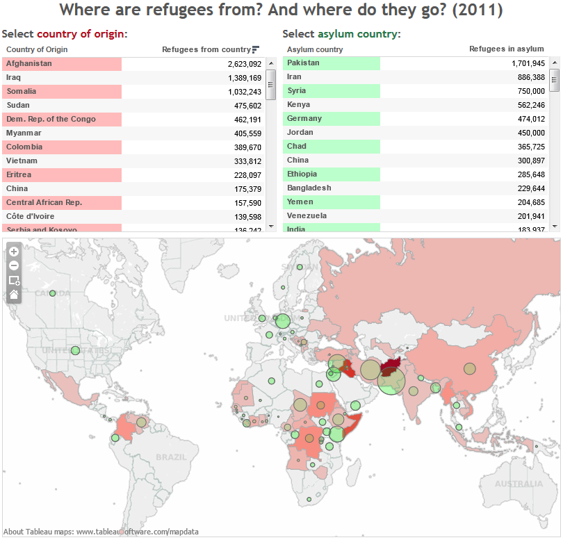
As a consequence of armed conflicts happening in different parts of the world, inhabitants in those regions had been forced to flee and seek refuge in other countries.

As of 2011, the largest number of refugees was coming from Afghanistan (2.6 million people), followed by Iraq (1.4 million), and Somalia (1 million), as seen in the map above in color red. Countries where these refugees were seeking asylum included Pakistan, Iran, Syria, Kenya, Germany, and Jordan.

Up to the point when this data was collected, there was not an armed conflict going on in Syria. In fact, Syria was listed as an asylum destination for refugees coming from Iraq. That has changed now, and Syria has joined other countries torn by conflict whose inhabitants are seeking asylum in other parts of the world.

Source: Global Refugee Tracker: where are refugees from? And where do they go (2011)


Every Protest in the World Since 1979

every protest since 1978According to the Global Database of Events, Language, and Tone (GDELT) website, an estimated 250 million incidents have occurred since 1979, ranging from protests and violence, to change in military or police attitudes.

The dots spread across North Africa in 2011, for example, hint to the Arab Spring protests taking place at the time in that region. In a similar manner the cluster of dots concentrated in the Middle East, more precisely in Syria, point to the ongoing conflict in that country.

For the interactive map, please visit: Foreign Policy: Mapped: Every Protest on the Planet Since 1979


The Higher Cost of Higher Education

higher-education-international-studentsStudying abroad can be very expensive, specially if you are looking at universities in Australia or the United States.

The average cost of higher education for international students is very high in Australia, where a student is expected to pay a total of $38,516 in annual fees and cost of living. Australia is followed by the U.S. where the average cost of one year of higher education is estimated at $35,705. Other countries with a steep tab on higher education include the United Kingdom, Canada, Japan, Singapore, and Hong Kong.

On the other hand, more affordable higher education can be found in Germany, where the average cost of one year of college annual fees plus cost of living is estimated at $6,285. Other countries with affordable higher education include Spain, Taiwan, China, and Russia.

Source: International Business Times- International Students: Higher Education Is Really Inexpensive In Germany, But Not In The US [CHARTS]


Climbing the Income Ladder in the U.S.

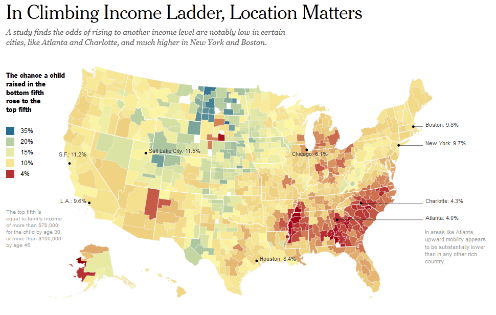
us climbing income ladderAccording to an article published by the New York Times it matters where you grow up in terms of upward income mobility in the United States.

The chance that a child raised in the bottom fifth (bottom 20%) will rise to the top fifth (top 20%) varies significantly within each state and across states as well. The odds are particularly bleak for the Southeast. In cities like Charlotte, Atlanta, Raleigh, to name a few, the chances of upward mobility are few, 4% or less. By contrast, the chances of upward mobility are the best in areas of the Midwest and West, 20% or higher. The odds of climbing the income ladder are good in cities like Boston, New York, Salt Lake City, Pittsburgh, and Seattle.

Source: The New York Times: In Climbing Income Ladder, Location Matters


Deaths by Hepatitis vs. Deaths by HIV by Country

hepatitis and hiv world HIV killed 1.47 million people in 2010. Viral hepatitis killed as many as 1.44 million people in the same year. Even though the number of deaths caused by viral hepatitis follows close that of HIV, its impact goes largely ignored worldwide.

According to The Economist, viral hepatitis killed more people in 117 out of 187 countries, including China, India, Japan, and the UK. In the map above, countries in dark red show a higher ratio of deaths by viral hepatitis to deaths caused by HIV. Those countries include Egypt, Mongolia, UK, Turkey, Yemen, Iraq, South and North Korea, Japan, Finland, Sweden, Poland, and Germany.

Source: The Economist: The other killer – Hepatitis kills more people than HIV in most countries


Minutes of Minimum-Wage Work to Buy a Big Mac Burger

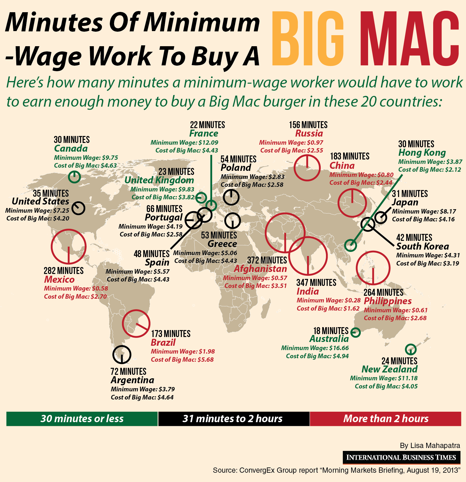
minutes of work for a big macUsing the criteria of the Big Mac Index developed by The Economist in 1986 as a way to measure if currencies are valued at the right level, the International Business Times created this visualization showing how many minutes a minimum-wage worker needs to work in order to buy a Big Mac burger.

As it turns out, a minimum-wage worker in Afghanistan needs to work 372 minutes (6.2 hours) in order to buy a Big Mac burger. In contrast, a minimum-wage worker in Australia needs to work only 18 minutes to buy a Big Mac burger.

Source: International Business Times: Minutes Of Minimum-Wage Work To Buy A Big Mac: 36 minutes in the US, 6 hours in Afghanistan


The Most and Least Ethnically Diverse Countries

diversity map harvardUsing data from the Harvard Institute for Economic Research, The Washington Post created this map that shows how ethnically diverse is a country.

Dark green countries are the more ethnically diverse. Such is the case of Canada, Mexico, several South American countries, including Peru, Bolivia, and Ecuador. The most ethnically diverse countries are located in Africa. In contrast, dark orange countries are more ethnically homogenous. That is the case of most European nations, China, Japan, South and North Korea, and Australia.


Writing Systems of the World

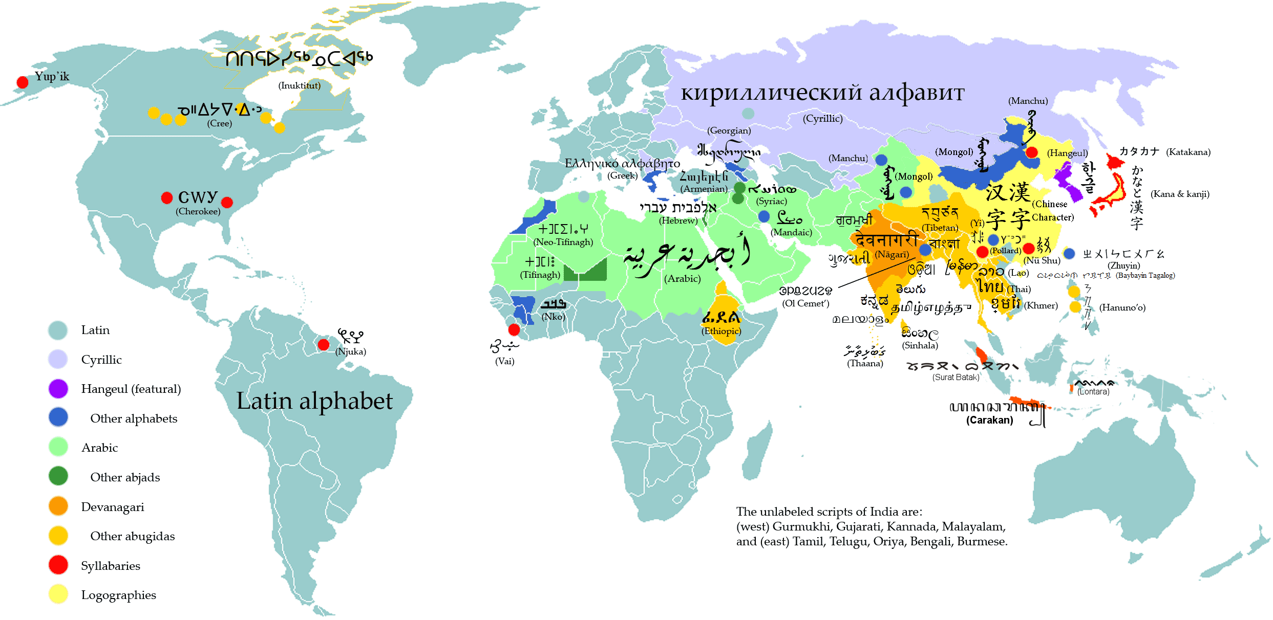
writing systems of the worldThis map published by the Washington Post shows the different writing systems used around the world.

The Latin alphabet is by far the most common used alphabet, from Europe to the Americas to Africa and Australia. The two other writing systems widely used are Arabic, used in the Middle East and Northern Africa, and Cyrillic used in Russia and other countries formerly part of the Soviet Union.


The United States Leads in Mobile Monetization

us leads in mobile monetizationAccording to Statista global revenue from mobile advertising almost doubled in 2012, increasing from $4.9 billion back in 2011 to $9.1 billion.

In North America alone, the amount spent on mobile ads per mobile subscription reached $9.39 on 2012 compared to $4.53 on the previous year. That fact puts North America as the leader in mobile advertising worldwide. Western Europe follows with $2.91 spent on mobile ads per mobile subscription, more than double the amount spent on the previous year.