Tag Archives: Australia

Crude Oil Exports and Imports by Country

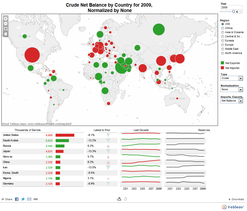
crude net balance by countryVast quantities of crude oil are exported and imported each year. Some countries are net exporters (their oil exports are larger than their oil imports), and some are net importers (their oil imports are larger than their exports).

In this visualization by Data Driven Consulting, we can see that the United States was the largest net importer of crude oil in 2009. Other net importer countries include China, India, Japan, South Korea, Germany, Belgium, Italy, UK, Spain, Singapore, and Australia.

Among the net exporters of crude oil we find Russia, Saudi Arabia, Iran, Iraq, Norway, Venezuela, Mexico, and Canada.

For the full-size interactive dashboard, visit: Tableau Public: Exporters and Importers


Body Mass Index (BMI) by Country

A body mass index (BMI) between 18.5 and 24.9 is usually considered a healthy body weight to height relationship. A BMI of 25 or higher indicates body weight not optimal for the height of a particular person.

This visualization published by Visual.ly, shows the different BMI values for adult men and women across the globe.

Countries with a healthy average BMI between 20 and 22.9 include several nations in Africa, Yemen, India, Thailand, Japan, Pakistan, Singapore, among others.

Countries with an average BMI between 23 and 24.9 include several Asian nations, several European nations (including France), some nations in Africa, and Honduras.

Countries with an average BMI between 25 and 26.9 include Canada, Russia, Costa Rica, Colombia, Israel, Austria, Switzerland, Brazil, all Nordic countries, Spain, Portugal, and nations in the Middle East.

Countries with an average BMI of 27 and over  (the highest BMI range) include the United States, Kuwait, Cuba, Argentina, Chile, Bolivia, Peru, Venezuela, Australia, UK, New Zealand, Greece, and Germany to name a few.


Human Development Index 2012

The Human Development Index (HDI) is a composite measure that includes three indicators: life expectancy at birth, level of education attained, and income. The HDI is an alternative to the purely economical GDP, that quantifies economic growth only. Thus, the HDI provide a way to gauge the development of a country. The HDI for 2012 includes 187 countries.

The HDI ranks countries according to their degree of development using a scale from 0 to1, 0 being the least developed and 1 being the most developed country.

In the HDI map above, published by the Brazilian media site Globo.com we find that Norway has a score of 0.955, ranking number one as the most developed country (color green). Norway is followed by Australia, the U.S., the Netherlands, Germany, New Zealand, among others.

At the other end of the spectrum we find the least developed nations (color purple), including the majority of African nations, Pakistan, Afghanistan, Myanmar, Bangladesh, Nepal, and Papua New Guinea.


The Political Rights of Women Worldwide

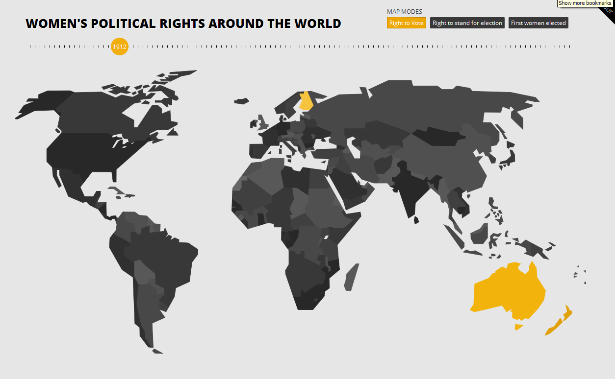
Back in 1912, the only countries where women had the right to vote were: New Zealand, which had granted voting rights to women as early as 1893; Australia, which had granted women the right to vote in 1902; and Finland, which had granted voting rights to women in 1906.


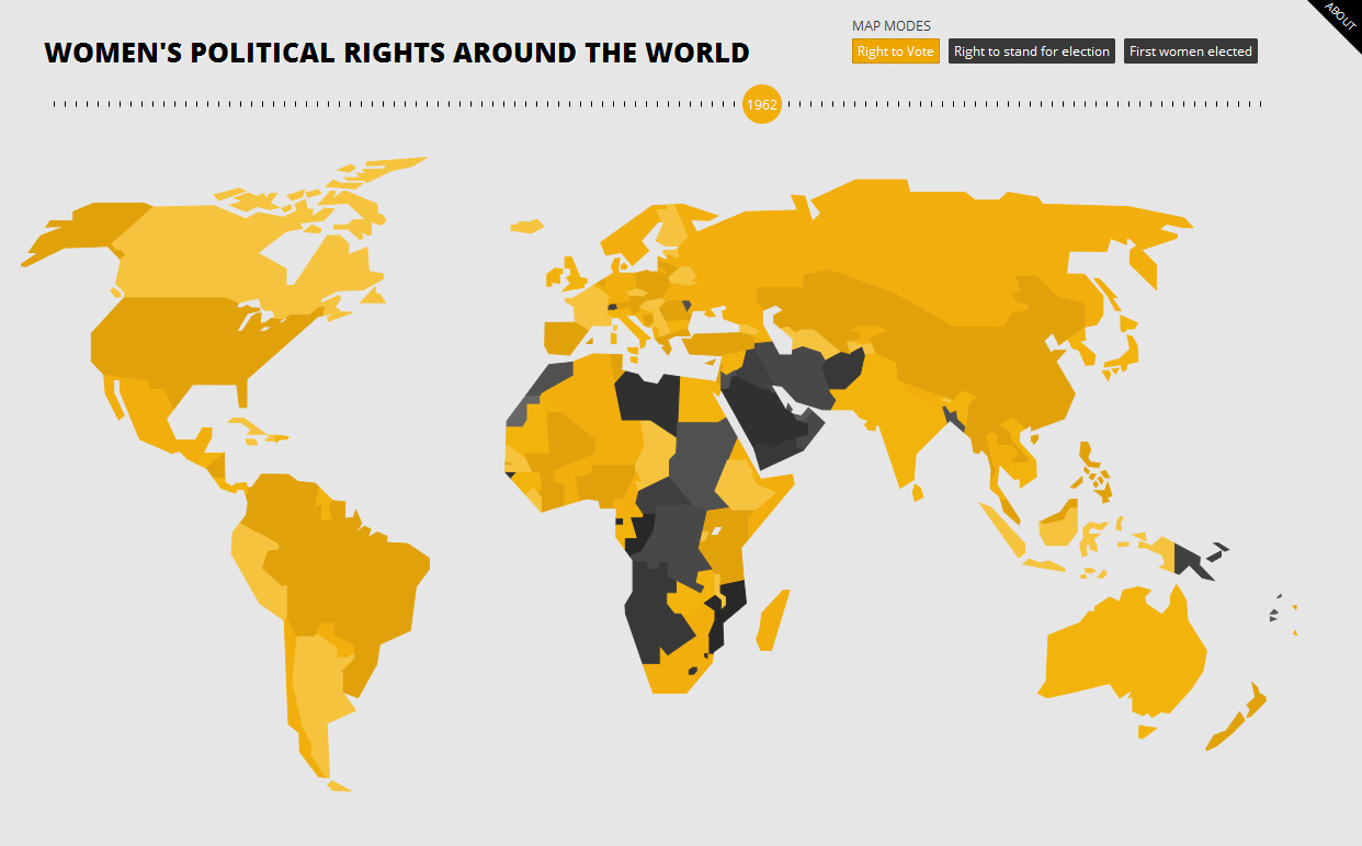
Fifty years later, in 1962, most nations in the world had granted women the right to vote. However, there were still many countries where women could not vote. Such countries included African nations like Morocco, Libya, Sudan, Congo, Angola, Botswana, Namibia, Mozambique, and Lesotho; countries in the Middle East like Jordan, Iraq, Saudi Arabia, Yemen, Syria, Oman, Iran, Afghanistan, and Bangladesh; Papua New Guinea, the only country is Asia. The nation that comes as a surprise in Switzerland, where women were granted voting rights as recently as 1971.


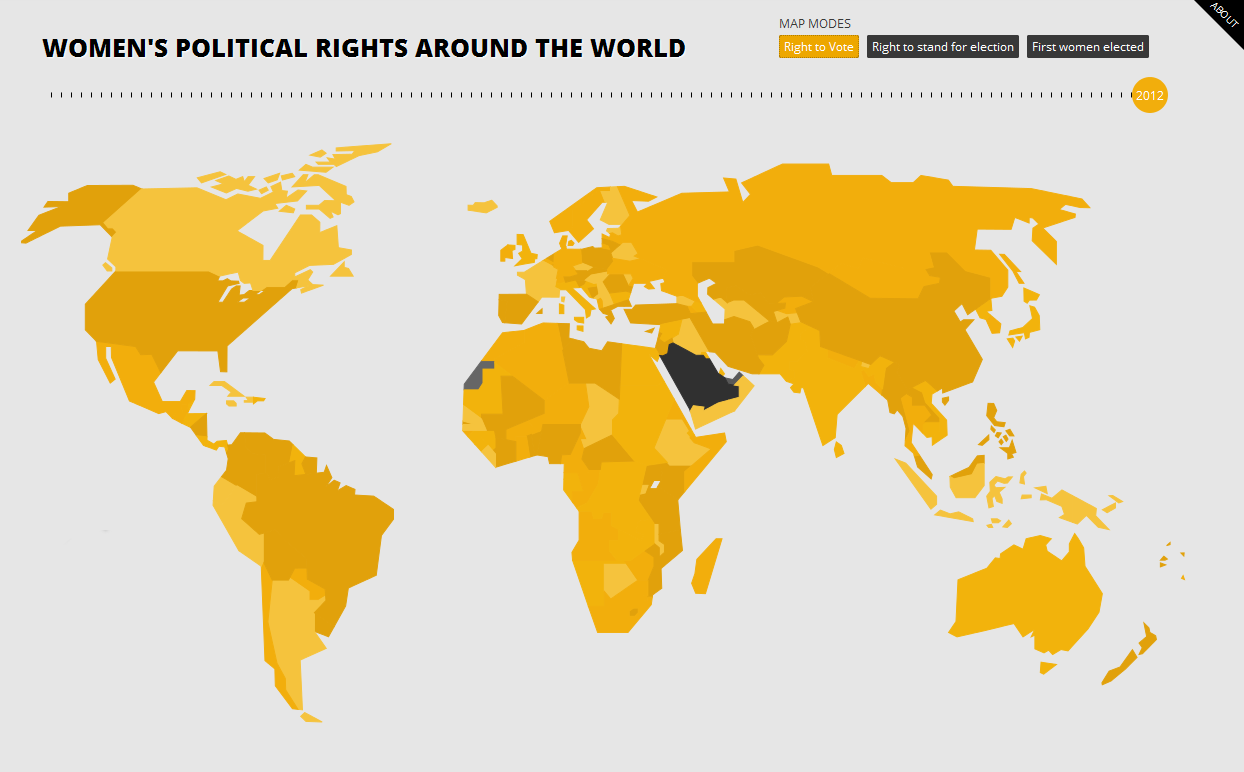
As of 2012, women have the right to vote anywhere in the world, except in Saudi Arabia.

For interactive maps on women voting rights, the right of women to stand for election, and first women elected to office worldwide, please visit:  777 Voting: Women’s Political Rights Around the World


Expected Years of Schooling for Females Worldwide

The expected years of schooling for females varies from country to country.

Developed nations such as the United States, Canada, the UK, France, Germany, Norway, Iceland, Australia, New Zealand, etc., show the highest number of expected years of schooling (15 to 21 years) for girls. Other nations in this group include Argentina, Uruguay, Kazakhstan, Libya, and South Korea.

On the other hand, countries with the lowest number of expected years of schooling (0 to 8 years) for females include most African countries, Pakistan, Afghanistan, Iraq, Yemen, Myanmar, Bangladesh, and Papua New Guinea.

Resource: The World Bank DataBank: Gender Statistics – Expected years of schooling for females

The Best and Worst Places to be Born in 2013

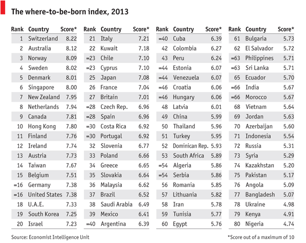
Back in 1988, the United States was ranked first as the best country to be born. Twenty five years later, the U.S. is ranked number 16.

The Economist Intelligence Unit compiled the where-to-be-born index which measures which country will provide the best opportunities to someone born in 2013. It links the results of life satisfaction surveys to indicators that affect the quality of life in those countries, such as geography, demographics, culture, government policies, the economy, etc.

Based on those factors, the best places to be born are Switzerland, Australia followed by Norway, Sweden Denmark, and Singapore. At the bottom of the list you will find Nigeria, Kenya, Ukraine, Bangladesh, Angola, Pakistan, among others.


The Global Public Debt Clock is Ticking

click to enlarge

Global public debt is increasing every second. This debt clock shows government debt, in dollar terms, for almost all countries. Governments with the highest debt include the United States, Canada, Brazil, Australia, India, China, and several western European nations.

Additional indicators such as public debt per person, public debt as percentage of GDP, total annual debt change, and country debt comparisons can be seen in the interactive map at: The Economist: The global debt clock


Cocaine Consumption by Country

click to enlarge

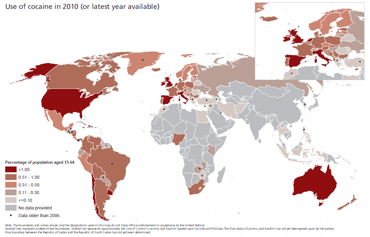
Illicit drugs consumption seems to be relatively stable around the world, except in developing countries, where it seems to be on the rise. Although the total area for the cultivation of the coca leaf has decreased 33% since 2000, 18% decrease between 2007 and 2010, the number of deaths from heroin and cocaine abuse is estimated at 200 thousand per year.

This map shows cocaine consumption around the world, the richest countries being among the top consumers. Complete details can be found at: United Nations Office of Drug and Crime (UNODC) – World Drug Report 2012