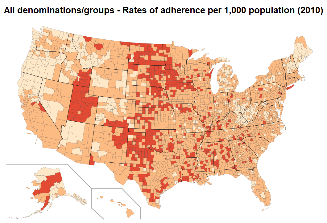
We recently came across a study about church membership in the US conducted by the Association of Statisticians of American Religious Bodies (ASARB). The study compiled data on the number of congregations and adherents for 236 religious groups in each county of the US. We were curious about what the data would look like displayed on a map, so we created the thematic map shown above (click on it for the larger version). We chose three colors to represent the rate of adherence: the lighter color is for counties where the rate of adherence is less than 333 per 1000 inhabitants. The medium color is for counties with a rate of adherence between 333 and 667, and the darkest color is for counties with rate of adherence greater than 667 per 1000.
Note: The data were downloaded from the Association of Religion Data Archives, www.TheARDA.com
