Tag Archives: Qatar

Internet Population and Penetration by Country

internet population and penetration

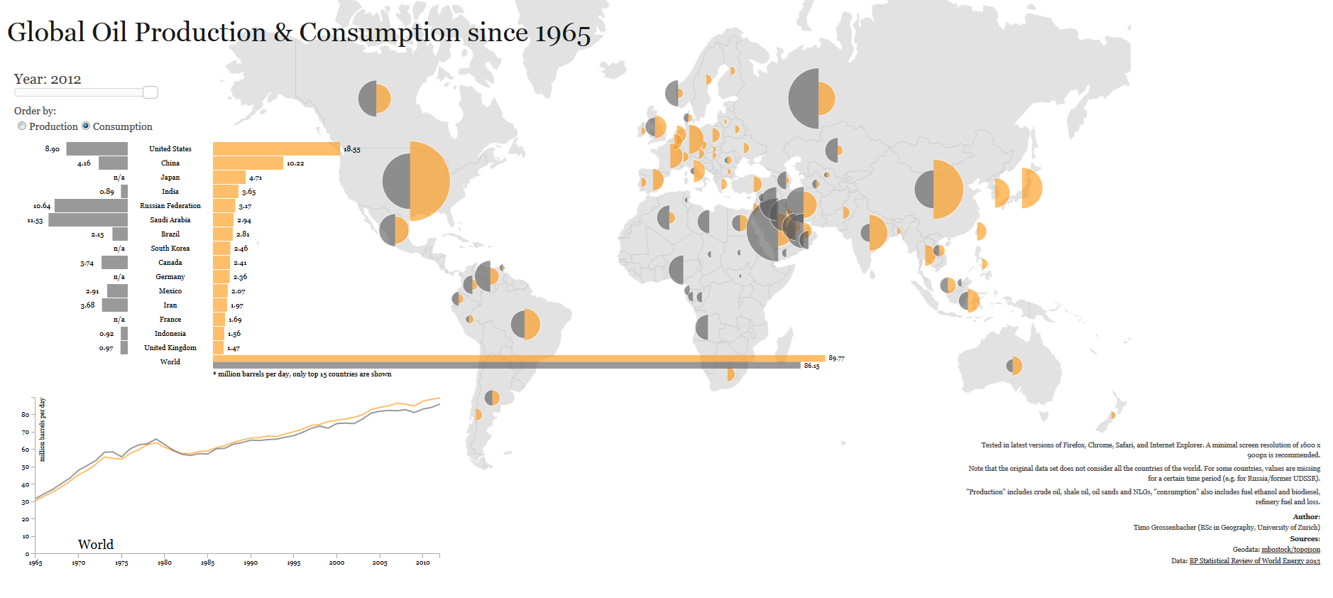
An estimated one third of the world population is connected to the internet while the remaining two thirds do not have have access to it yet, according to the website Information Geographies.

As shown in the map above, the distortion in the size of China points out the fact that it is the country with the largest number of internet users, roughly 500 million people. China is followed by the United States, India, and Japan, among others.

Countries with the largest internet penetration, the percentage of the population of each country connected to the internet, include Canada, Great Britain, Netherlands, Denmark, Norway, Sweden, South Korea, Germany, Finland, Qatar, and New Zealand.

Source: Information Geographies: Internet Population and Penetration
 

Oil Production and Consumption by Country

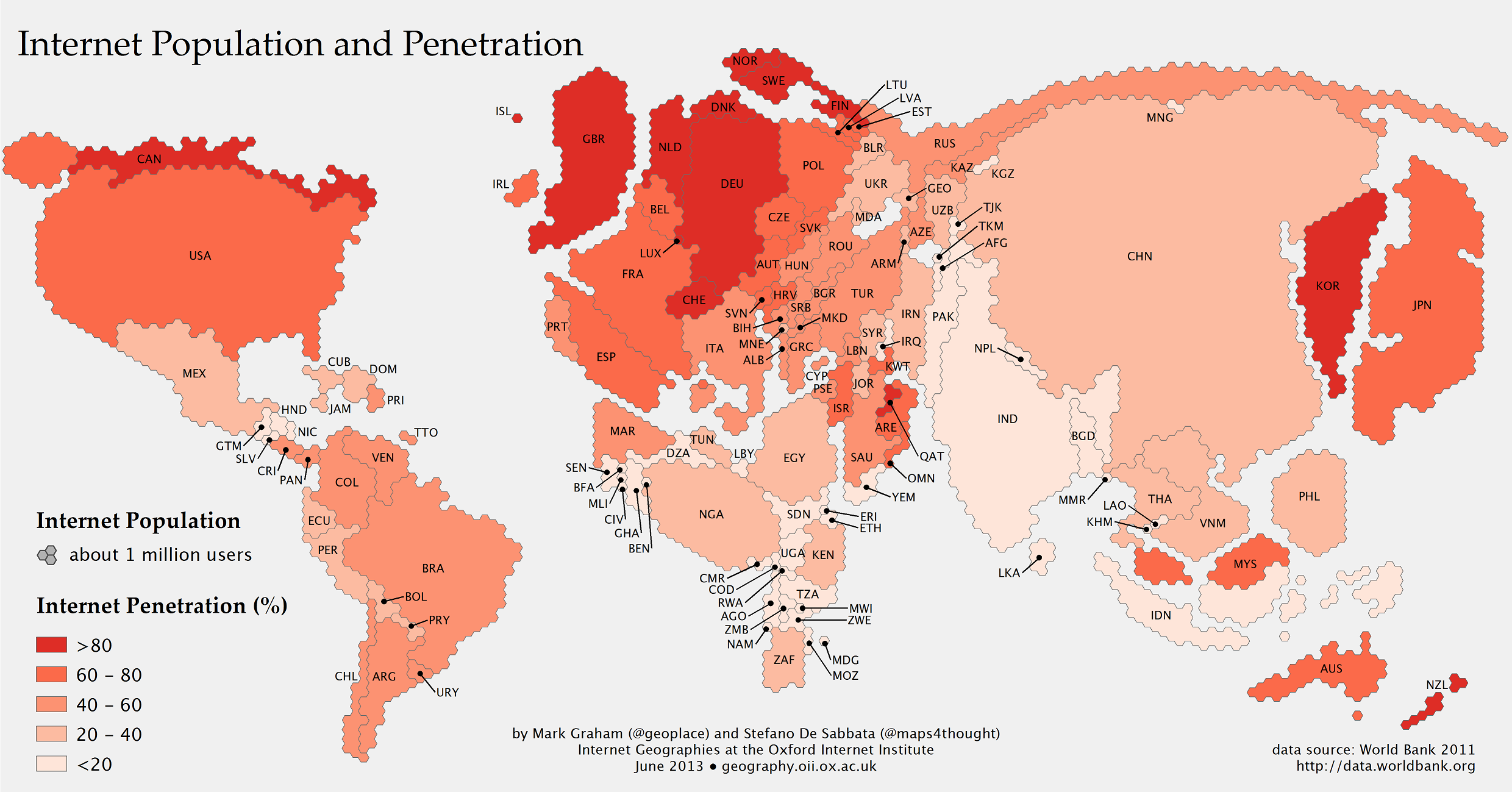
oil production and consumption since 1965When it comes to oil production and consumption, countries have a very close relationship of interdependence with each other. Some countries consume more oil than what they produce relying on imports to satisfy their internal demand. Others, consume less than what they produce, being able to export oil to nations that need it.

Oil consumption (yellow) for the United States, for example, was larger than its production (grey) for 2012, 18.55 mb/d (million barrels per day) compared to 8.9 mb/d, importing more than double its production to satisfy the gap in internal demand. Other nations with oil consumption higher that oil production include China, Brazil, Australia, India, UK, and Indonesia.

In contrast, oil consumption for Saudi Arabia for 2012 is estimated at 2.94 mb/d, while its production reached 11.53 md/d, exporting its oil surplus to the rest of the world. Other nations whose oil production exceeds its oil consumption include Canada, Mexico, Venezuela, Norway, Russia, Kuwait, United Arab Emirates, and Qatar.

Source: Winston Smith Labs: Global Oil Production and Consumption since 1965 [Interactive Map/Graph]


Education Expenditure vs. Military Expenditure

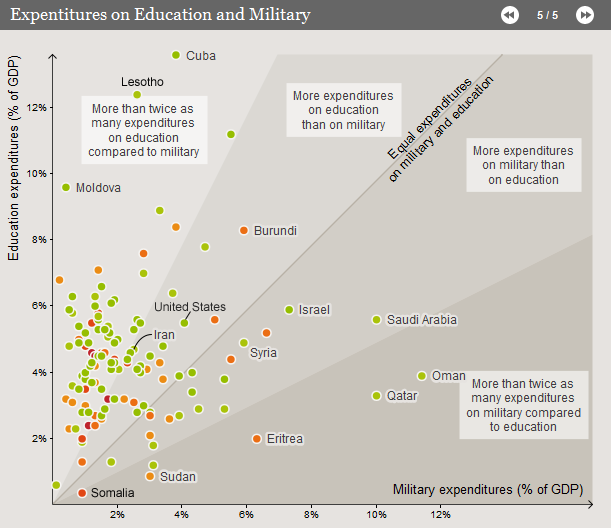
This visualization by the Deutsche Welle, shows how much is spent in education versus how much is spent in the military, as a percentage of the GDP, worldwide.

The dividing line denotes equal expenditure in both education and the military. Most countries seem to be concentrated on the left side of the line, meaning they spend more in education than in defense. Countries in this group include the United States, Iran, Portugal, Italy, Germany, Canada, etc. The country that immediately grabs our attention is Cuba, showing the highest expenditure in education (about 13% of its GDP) relative to its expenditure in defense (about 4% of its GDP). Lesotho follows Cuba very closely.

On the right side of the dividing line, we have the nations spending more on the military relative to education spending. Countries in this group include: Somalia, Sudan, Syria, Israel, etc. It is worth noting that Oman shows the highest expenditure in defense (close to 12% of its GDP) relative to its expenditure in education (about 4% of its GDP). Saudi Arabia and Qatar follow Oman closely.

For more visualizations of education indicators worldwide, visit: Deutsche Welle: In Numbers: Education Around the World